Typography's Exercise

(Week 01 - Week 06)
Fong Ee Xuan (0332842)
Typography
Exercise
LECTURE NOTES
Lecture 1: Introduction to Typography
Week 01
(29/08/18)
Today is my first Typography class. At first, Mr Vinod briefed us about this module and asked us to create a Blogger for the e-portfolio. After that, he explained to us what are needed in our blog. He also explained every part of the blog to us in details so that we can follow the format that he want.Mr Vinod introduce the important terminology in typography which are : Font, Typeface and Typefamily.
Font
- Coming out from a France word which is foundries
- A process of creation
Typeface
- A individual face from one family
- e.g. Arial Black, Arial MT, Arial Narrow
Typefamily
- different weight within an individual typeface
Lecture 2 : Typography/ Basic
Week 02 (05/09/2018)
In this week, Mr Vinod introduced us basic of typography and many different technical terms. The Boundaries of letterform are baseline, median, x-height.
Figure 1.0: There are many terms, to describing letterform
Ascender Height : Part of the letter which extends above the median
Cap line : The Imaginary horizontal line which the resting upon the top of uppercase letters
Baseline : The imaginary horizontal line which the majority of the characters in typeface sit
Median : The imaginary line defining the x-height of letterform
X-Height : The height of the body of lowercase letter of typeface
Descender Height : Part of the letter which extends below the median
After that, Mr Vinod also introduced other letterforms part which are apex, arm, beak, bowl, barb, bracket, cross bar, cross stroke, crotch, ear, em/en, finial, leg, ligature, link, loop, serif, shoulder, spine, spur, stem, stress, swash, strokes, tail and terminal. Mr Vinod told us that the readability of the letter will increase when the x-height become more large. There are also some typeface have larger x-height than other which are Georgia, Time New Roman, Helevetica and also Arial.
Lecture 3
Week 03 (12/09/18)
There was no lecture today, we continued do our passages on the class. After that, Mr Shamsul lead us to the lettering process.Lecture 4 : Development / Timeline
Week 04 (19/09/18)
Mr Vinod introduced us the development and timeline of typography. Typography is written from the perspective of the western world, which tends to ignorantly or conveniently overlook inventions and innovations in Asia. Mr Vinod told us that we have to do our own reading to get the fact of it.The early letterform development are from Phoenician and Roman.
PHOENICIAN TO ROMAN
- Writing meant scratching into wet clay with sharped stick or carving into stone with a chisel
- Uppercase letterforms can be seen ti have evolved out of these tools and materials (nearly 2000 years for only letterform
- Uppercase just a simply combination if straight line and pieces of circle, as the materials & tools of early writing required
- They make the first 26 alphabets
- The Greek change the direction of writing
- Developed a style of writing which is "BOUSTROPHEDON"
- Etruscan then Roman worked with marble carved
- change the weight from vertical to horizontal and broadening of the stroke at start and finish

Figure 1.2 : Scratching at wet clay.

Figure 1.3 : Direction of Greeks write


Figure 1.4 : The different between Phoenician, Greek and Roman
After that, Mr Vinod say about hand script form 3rd to 10th century C.E which is Square capital, Rustic Capital, Uncial and Charlemagne.
SQUARE CAPITAL
- Written version that can found in Roman Monuments
- Have Serifs added to the finish of the main strokes
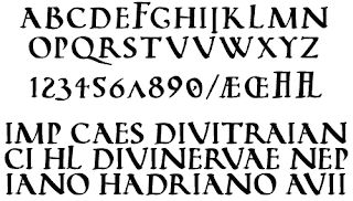

Figure 1.5 : Example of Square Capital
RUSTIC CAPITAL
- Allowed for twice as many words on a sheet of parchment and took less time to write
- Pen or Brush were held at an angle of approximately 30 degree off the perpendicular
- Faster and easier to write but harder to read

- Pen or Brush were held at an angle of approximately 30 degree off the perpendicular
- Faster and easier to write but harder to read

Figure 1.6 : Example of Rustic Capital
UNCIAL

- Incorporated some aspects of the Roman cursive hand especially in the shape of the "A, D, E, H, M, U and Q.

Figure 1.7 : Example of Uncial
CHARLEMAGNE
- First unifier of Europe since the Romans, issued on edit in 789 to standardise all ecclesiastical texts

Figure 1.8 : Example of Charlemagne
Mr Vinod also mentioned about Blackletter to Gutenberg's type and Gutenberg's skills included engineering, matalsmithing, and also chemistry.
There are also some text type classification
- 1450 blackletter
- 1475 old style
- 1500 Italic
- 1550 Script
- 1750 Transitional
- 1775 Modern
- 1825 Square Serif / Slab Serif
- 1900 Sans Serif
- 1990 Serif / Sans Serif
Lecture 05
Week 05 (26/09/18)
Today we got no lecture. We continued our lettering and Mr Vinod and Mr Shamsul teach us how to use Adobe Photoshop to animation our lettering.Lecture 06
Week 06 (03/10/18)
Today we show our type expression to Mr Vinod and Mr Shamsul. After that, we processed to animation one of the type expression that we choose. Around 5 o'clock, Mr Vinod introduced us our first project. He told us how to use the Abode InDesign.INSTRUCTIONS
EXERCISE
Calligraphy
Week 01- Week 03
(29/08/18 - 12/09/18)
For the few week, we being given some exercise about calligraphy. At first week, Mr Vinod asked us to started with vertical , horizontal and circular strokes. The aim for this exercise is to help us find the most comfortable ways to hold the calligraphy pen without changing the direction. We has been requested to complete a page of it by using 3.0 calligraphy pen.
Figure 1.11: My vertical, horizontal and circular strokes
After we finish our first exercise which is complete the vertical horizontal and circular strokes, Mr Vinod give us some type which is blackletter, uncial, Roundhand and chancery calligraphy and asked us to choose our own hands that we are most comfortable with.
At first I try to write every type that giving but at last I chosen Blackletter Calligraphy because I can write it with the comfortable way.


Figure 1.12: I tied every type that given by Mr Vinod


Figure 1.13 : My final attempt for Alphabet "A" to "Z"
After we done with our alphabets, Mr Vinod asked us to choose a passage which have three sentences and each sentences have three to four words.

Figure 1.14 : My first attempt of passage

Figure 1.15 : I tired write in a plain A4 paper

Figure 1.16 : I tried use 2.0 calligraphy pen

Figure 1.17 : My final attempt of passage
LETTERING
Week 04 - Week 05
(19/09/18 - 26/09/18)
On this few week, Mr Vinod and Mr Shamsul give us another exercise which is lettering. They asked us to design our lettering for our own name and the lettering have to related to our personality and characteristics.
At first, I choose few of my personality to make my lettering which is stubborn and easygoing. This is because I am a stubborn person when I think that something is right and I always ok with everything and just follow it, just like the wave.

After few design, I felt like lettering that look stubborn are a bit hard to create so I decide to use "easygoing". I focus on create lettering by using "easygoing".


After that, Mr Vinod want it to make animation it. So they teach us to use Adobe Photoshop to make it work.


At first, I choose few of my personality to make my lettering which is stubborn and easygoing. This is because I am a stubborn person when I think that something is right and I always ok with everything and just follow it, just like the wave.

Figure 2.1: "Stubborn" and "Easygoing" Lettering
After few design, I felt like lettering that look stubborn are a bit hard to create so I decide to use "easygoing". I focus on create lettering by using "easygoing".

Figure 2.2 : Rough attempt of "Easygoing"

Figure 2.3 : Few type of "easygoing"
After that, Mr Vinod want it to make animation it. So they teach us to use Adobe Photoshop to make it work.

Figure 2.4 : I tired to trace it on Adobe Illustrator

Figure 2.5 : Creating the scene using Adobe Illustrator

Figure 2.6 : All those lettering that have to animation it

Figure 2.7 : The process I animation the lettering.

Figure 2.8: Static attempt of my final lettering.

Figure 2.9 : My final Lettering GIF


TYPE EXPRESSION
TYPE EXPRESSION
Week 06 - Week 07
(03/10/18 - 10/10/18)
In this week, Mr Vinod give us an exercise which is type expression. He let the whole class to decided what are those words. After we few discussions, those words are out which are "SPAKLE, FLOAT, BLUR, HEAVY, TALL and RAGE". Mr Vinod give us some guideline, for example the size have to be square which are 8 x 8cm, the space between each square have to be 7mm and the space between the top and bottom' s square have to be 2cm.

Figure 3.1 : My first attempt of type expression

Figure 3.2 : Make it using Adobe Illustrator

Figure 3.3 : My final attempt of type expression
After we finish our six of type expression, Mr Vinod required us to choose one of it and animation it. In those type expression, I chosen to animation "HEAVY" because I think it will be fun by doing it.
Figure 3.4 : The process of animation the "HEAVY"

Figure 3.5 : The first attempt of "HEAVY"

Figure 3.6 : My final result of "HEAVY"
FEEDBACK
Week 02
05/09/18
Mr Vinod and Mr Shamsul mentioned that we should not change the direction of holding calligraphy pen when we are drawing those line because it will be more difficult when we actually writing those typeface. Beside that, Mr Shamsul commented that my horizontal line is not that straight and the stroke of circular have to be more clear.
Week 03
12/09/18
On the first attempt, Mr Shamsul said that the overall aren't bad but he does mentioned that my x-height of alphabet "s" should be same as other and the stroke of all alphabet should be clear enough. To make the stories more clear, Mr Shamsul advised me to use 2.0 calligraphy pen and see what is the different. Not only that, he also mentioned that my space between sentences aren't bad, just the words spacing between each other are abit too wide.
On my second attempt, Mr Shamsul said that my strokes of alphabet are more clear just the proportion of the passage are abit too high.
Week 04
19/09/18
Mr Vinod said that we should choose only one of our character when we want to design the name. This is because if we try to combined everything together it will get more mess. After that, Mr Vinod also mentioned that we should draw or sketching on the graph paper rather than sketching on a blank paper.
There are two feedback for this week which is calligraphy and lettering. The feedback for my calligraphy is Mr Vinod said that my type are too big if I going to use the 2.0 calligraphy pen. After that, Mr Vinod and Mr Shamsul give some comment about my lettering. For the first type of lettering which is Stubborn, Mr Vinod said that stubborn lettering dones't look like that, stubborn lettering more look like solid such as mountain. After I try few times by using stubborn to create the lettering, I decided to change it to Easy-going just like the sea following the wave. I show it to Mr Shamsal and he told me to keep going and my 'N" can be more smooth, not need to be that sharp because wave are smooth. After I drawn and sketched for few times, I shown it to Mr Vinod and he said it look like easy-going and told me to keep on doing it.
I showed Mr Shamsul my first attempt and he does give some comment. He said that most of my type expression are not okay and asked me to improve more.
After I adjusted it, I show it to Mr Vinod and he said that I have to change the font of my "FLOAT" but the wave is okay. He also said that my "BLUR" is okay but have to make it more lighter. Besides that, Mr Vinod also mentioned that the "V" that in my "HEAVY" have to be more slanted and have to adjust the position of it so that the "Y" look more like a victim that get press by the "V". He does comment on the "TALL" and "RAGE" He mentioned that my "TALL" is okay and I have to change the font of "RAGE" because the font that I choose are too classic.
When I know I can create my own lettering, I was kind of excited. After I start design it, I realise it is quite hard to put our characteristic in to a word or even a name but it is quite challenging.
Week 05
26/09/18
I showed Mr Shamsul my digitalisation and I told he what I want in the animation and he said it's ok. After I done my first attempt of animation, I showed it to Mr Shamsul and he mentioned that my animation are moving and shaking. He told me to keep doing it and improved.Week 06
03/10/18
The general feedback that given this week is we have to take a clearly photo when we want to update it to the blog and we have to take the photo under the sunlight and not under the room lightbulb because it will show shadow.I showed Mr Shamsul my first attempt and he does give some comment. He said that most of my type expression are not okay and asked me to improve more.
After I adjusted it, I show it to Mr Vinod and he said that I have to change the font of my "FLOAT" but the wave is okay. He also said that my "BLUR" is okay but have to make it more lighter. Besides that, Mr Vinod also mentioned that the "V" that in my "HEAVY" have to be more slanted and have to adjust the position of it so that the "Y" look more like a victim that get press by the "V". He does comment on the "TALL" and "RAGE" He mentioned that my "TALL" is okay and I have to change the font of "RAGE" because the font that I choose are too classic.
REFELCTION
EXPERIENCES
WEEK 01 (29/08/18)
I was excited about the first class and I had learn more about typography that I though. I felt challenging after Mr Vinod and Mr Shamsul give us some exercise which is about drawing the vertical, horizontal and circular strokes.WEEK 02 (05/09/18)
I was a bit sleepy on that day but I still kind of excited to learn more about typography. I was shocked when Mr Vinod and Mr Shamsul introduced us those terminology in typography. After that I feel more challenge when Mr Vinod and Mr Shamsul required us to write alphabet "A" to " alphabet "Z".WEEK 03 (12/09/18)
I was upset that day when Mr Shamsul said that my strokes are not clear enough. After I wrote and practice few times, I started feel annoying but at the same time I felt confident everytime I practice my passage.WEEK 04 (19/09/18)
I was kind of annoyed when Mr Vinod said my font of passage are abit too big if I want to use 2.0 calligraphy pen. But after that, I choose back my first choice which are using the 3.0 calligraphy pen to finish my passage.When I know I can create my own lettering, I was kind of excited. After I start design it, I realise it is quite hard to put our characteristic in to a word or even a name but it is quite challenging.
WEEK 05 (26/09/18)
I was excited in this week because I finally can learn how to do GIF by myself.WEEK 06 (03/10/18)
I was kind of tired when I animation the type expression, I didn't know that we have to create so many frame.
OBSERVATION
WEEK 01 (29/08/18)
I noticed that taking notes on lecture and practice are very important.WEEK 02 (05/09/18)
I realised that sleep is important too when you got a six hours on the next day and there are many things that we need to learn.WEEK 03 (12/09/18)
I noticed that practice typography are very important when you have to write a passage without looking at the sample.WEEK 04 (19/09/18)
I think that I was excited by creating my own lettering and animation it because I always want to do it but I don't know how to start.WEEK 05 (26/09/18)
I realised that it is quite long work when we edit the animation in Adobe illustrator but I also noticed that GIF is quite easy to do if we done the animation at Adobe Illustrator nicely.WEEK 06 (03/10/18)
I realised that if there are more frame when we doing the animation for type expression, the smoother it will be.FINDING
WEEK 01 (20/08/18)
I was excited because I finally can learn what is typography are about and I finally know what typographer always do. After that I felt challenged because I feel that holding the pen already is a bit challenge.WEEK 02 (05/09/18)
I was sleepy on that day because I not enough sleep. I was shock about the terminology of typography because I told typography just a simple font thingy.WEEK 03 (12/09/18)
I was upset because I have practice the alphabets for whole week but still not clear enough. Even though I think keep writing the same passage are annoying but I felt confident every single times I wrote it. This is because I can write the passage without looking at the sample.WEEK 04 (19/09/18)
I was annoyed because I used 3.0 calligraphy pen and 2.0 calligraphy pen but the work still not there yet. After that I realise that the strokes wasn't clear enough when I using 3.0 calligraphy pen is because the pen become rough after being used by many times.WEEK 05 (26/09/18)
It is quite long work when editing at Adobe Illustrator because we have to adjusted the word to see its smooth or not. If not when we more on to digitalisation, it will become weird or moving when you don't want it move. And because of the moving, we have to edit it from the beginning at Adobe Illustrator.WEEK 06 (03/10/18)
I was tired during the animation because it have many frame and I have to adjust every word in every frame. But I found out that when it have more frame, the GIF will be more smooth and it won't look weird.FURTHER READING
Week 01 - Week 03
(29/08/18 - 12/09/18)
"Typeface : Classic Typography For Contemporary Design" by Tamye Riggs


Figure 10 : "Typeface : Classic Typography For Contemporary Design"
This book is a collection of typefaces that hallmark important eras in typographic and printing history. There are 46 "base" typeface sections and many shown in multiple style and weight. In this book, there are provided the typographic timeline so that we can know which typography is in which type and the years of the typeface have been designed or found. Not only that, there also have many different types of typefamily in this book. I felt that this book is amazing because it not only shown the typefamily and the typefaces, it also given the historical notes of the typefamily. In this section, it describes the development of featured typefamily and also some information that included notes in the era when the type was developed, details about its designer or founder, application, why the type if significant to the history of typography and other important facts.
I am choosing one of my favourite typefamily to talk about it which is Rosewood. I love this typefamily is because it look neatly and it is very comfortable to read and display. Rosewood was designed by Carl Crossgrove, Carol Twombly and Kim Baker Chansler in the early 1990's. Rosewood contains two typefaces designed specifically for layering. The regular weight of Rosewood is ornamental, with a great deal for open space and design to overlay the solid Rosewood Fill. But the interesting part is nowadays, designer are using the Fill variant without the overlay which is soft, narrow forms and uneven spacing to lend a unique appearance to headlines and typographic accent.
In the book, the author mentioned that understanding what makes up a font is the key to know the definition of a glyph. A glyph is an image that used in the visual representation of a given character and it will determine how a character kooks like. Besides that, a font also is a set of glyphs and it make every font have different "character".


Comments
Post a Comment