Design Principles's Exercise & Project

27/08/18 -
(Week 01- Week 14)
Fong Ee Xuan (02332842)
Design Principles
INSTRUCTIONS
LECTURE
Lecture 01: Module Briefing & Contrast
Week 01
27/08/18
Today is our first day of design principles.After Ms Sherry brief us about the module, we started our first lecture which is Contrast. Contrast is the difference in the luminance or colour that makes an object distinguishable.

Figure 1.0 Some examples of Contrast
Today Ms Sherry give us a lecture about Gestalt Principles. Gestalt is a psychology term which means "unified whole". It theories attempt to describe how people tend to organise visual element into ground or unified wholes when certain principles are applied. There are few basic about gestalt which are Similarity, Proximity, Continuation, Closure and Figure & Ground.
Lecture 02: Gestalt Principles
Week 02
04/09/18
Lecture 02: Gestalt Principles
Week 02
04/09/18

Figure 2.1 Example of Similarity

Figure 2.2 Example of Proximity


Figure 2.3 Examples of Continuation


Figure 2.4 Examples of Closure


Figure 2.5 Examples of Figure & Ground
Lecture 03: Symmetry, Asymmetry, Balanced & Dominace Principles
Week 03
13/09/18
Start from this week, our lecturer Ms Sherry decided to let us do the lecture. Today lecture is about Symmetry, Asymmetry, Balanced & Dominace Principles.Symmetry
- When two or more parts are identical after flip, turn or slide.
- The simplest type are "Reflection" or "Mirror"


Figure 3.0 Example of Symmetry
Asymmetry
- An irregular or imbalance in the spatial pattern or shape or arrangement of an object or figure
- having two side or halves are not the same

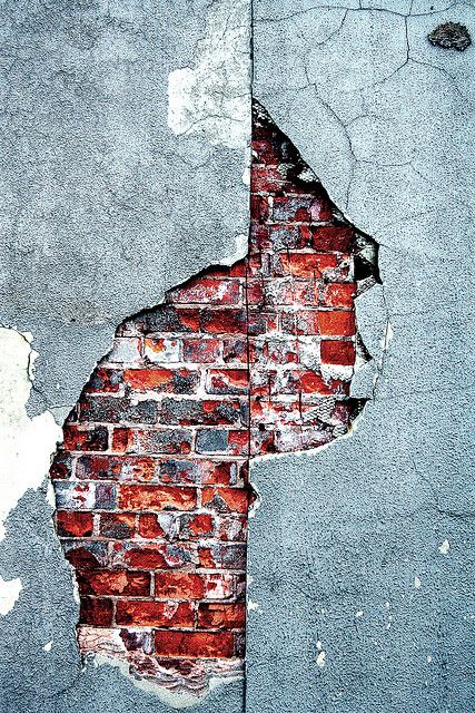
Figure 3.1 Example of Asymmetry
Balanced
- Describe the ways that artist use the same element of art in a work of art.
- Distribution of the visual weight of object, colour, texture and space.

Figure 3.3 Example of Balanced
Dominance
- The strong focal point with the greatest visual weight
- The clear prevalence of a single element in the overall design

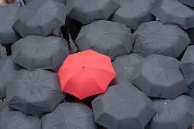
Figure 3.4 Examples of Dominance
Lecture 04: Pattern, Repetition, Texture & Surface Principles
Week 04
18/09/18
Lecture of this week are Pattern, Repetition, Texture & Surface Principles. The lecture also presented by our classmates.Pattern
- Repeating of an object or symbol all over the work of art
- Repeating the same elements
Four general types of pattern
- Branching ( An obvious form of patterning in the plant world)
- Spiral ( Seen from the scale of galaxies to the opening "fiddlehead" buds of farms, to the forms of microscopic animals)
- Flow ( Follows the path of least resistance)- Packing and Cracking (Refers to the way in which compacted cells define each others shape)


Figure 4.1 Examples of pattern
- Use the similar or connected pictorial elements.
- Can be even or uneven and regular or irregular
- Can be in the form of radiation where the repeated elements spread out from the central point
- May be in form of gradation where the repeated elements slowly become bigger or smaller


Figure 4.2 Examples of repetition
Texture
- Quality of an object which er sense through touch
- Exists as a literal surface we can not only feel but also the surface that we can see and imagine the sensation might have if we felt it.
- Can be portrayed in an image


Figure 4.3 Examples of texture
Surface
- The outermost/uppermost layer of a physical object or space
- Any type of median is applied on
- Allow us to see things in 2 dimensional perspective


Figure 4.4 Examples of surface
Lecture 05 : Alignment, Hierarchy, Placement, Direction
Week 0525/09/18
Alignment is the arrangement of visual elements so they line up in a composition. There are few type of alignment which are edge alignment, centre alignment and visual / optical alignment.
Type of alignment
- Edge Alignment
(the arrangement of element in relation to the edges of the page or canvas)


Figure 5.1: Examples of edge alignment
(where the elements are aligned at the centre)


Figure 5.2 : Examples of centre alignment
- Visual / Optical Alignment
(fix some of the problems that can occur with other type of alignment due to the varying shape of letters and graphics)
(the object may not be precisely aligned but to the eyes they are appear lined up)

Figure 5.3 : Example of optical alignment

- Scale (Large items draw the eyes)


Figure 5.4 : Some example of scale in hierarchy
- Colour & Contrast (Object that different from the surroundings catches viewer's attention)
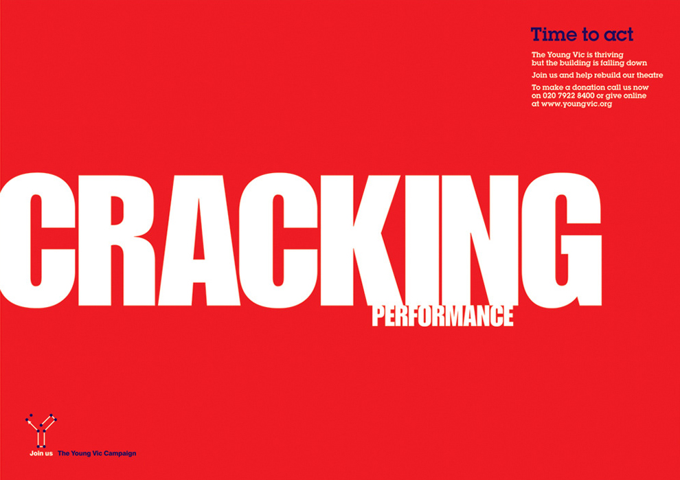

Figure 5.5 : Example of colour & contrast in hierarchy

Figure 5.6 : Example of white space in hierarchy

Figure : Example of hierarchy without proximity and with proximity
Placement is the change and position of shape or objects that can affect the visual depth and composition of an artwork.


Figure 5.6 : Examples of placement in hierarchy


Figure 5.7 Examples of horizontal direction

Figure 5.8: Example of vertical direction

Figure 5.9 : Example of diagonal direction
Lecture 06 : Dot, Line, Size and Scale
Week 06
04/10/18
This week is me and my group turn to present and our topic is Dot, Line, Size and Scale.
Dot
- building blocks of everything else such as shape, form, mass, or blob with a centre
- a point of focused attention
- can form complex shapes, patterns, textures and other structure imaginable
- can imply direction and movement or even bringing us to line when combining the dots
Dot in Visual Design
- the smallest and most basic in graphic design
- can create a wide variety of visual effects
- Convey calmness (place the dot at the centre of an area)
- Tension (place the dot at the edge of an area)
Beside that, there are also some relationship between dot and dot which are 2 dot imply a structure. When two dot get close together, they start seen as a single object. Not only that, it will create figure/ground relationship when one dot are overlapping another dot.
When we repeating a dot, it can creates texture, makes stimulating and vivid effects through combination of different sizes, optical tension and also pointillism.

Line is the most fundamental in all the element of design. It is the starting place for most artistic creation whether one is starting fine draing or painting or even sketching ideas for a sculpture.
Type of Line
- Vertical line
- Horizontal line
- Diagonal line
- Zigzag line
- Curved line


Figure 6.1: Artworks that create by using dot
Type of Line
- Vertical line
- Horizontal line
- Diagonal line
- Zigzag line
- Curved line


Figure 6.2 : Some artwork that using simple line and a poster that using line to create some part
Size is how big or small an element is in relation to other object. It is simply the relationship of the area occupied by one shape to that of another. In design, they used size to convey important, attract attention and also create contrast. This is to make a particular element stand out or give it importance.


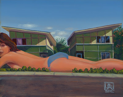
Scale refers to size and it can create emphasis, drama and aids hierarchy. Besides that, scale also can help us make sense of designs and images. We can size our elements dramatically large or small to create stunning effects and to signal which part of the design are most important and which are less.


Figure 6.2 : Some artwork that showed size principle
Scale refers to size and it can create emphasis, drama and aids hierarchy. Besides that, scale also can help us make sense of designs and images. We can size our elements dramatically large or small to create stunning effects and to signal which part of the design are most important and which are less.


Figure 6.4 : Example of an artwork and
a real life artwork in Austria by Artist Nychos that showed scale
Lecture 07 : Harmony, Movement, Rhythm
Week 07
09/10/18
Harmony can be described as sameness and the belonging of one thing with another. There are two types of harmony which are visual and conceptual harmony.
Visual Harmony is when an artwork are unified by colour, shape, composition or some other visual design principle. Conceptual Harmony is when an artwork has a common theme or concept throughout it.

Figure 7.1 : Example of artwork that shown harmony
Beside that there are few way to achieve harmony in artwork which are repetition of design element like colour, texture, shape and form. Next is thought repetition and rhythm. Not only that, it also can be achieved with the right amount of unity and variety.
Movement is the path of the viewer's eyes takes through the work of art often to focus of areas. Movement can die directed along lines, edges, shape and colour within the work of art.
Besides that, movement can be create through action because action can be indicated by the "freeze frame" effect of an object in motion such as fuzzy outlines, multiple image and anticipated movement.


Figure 7.2 Example of movement through action.
Movement also can be seen in repetition and rhythm. Repetition tend to tie things together and makes the eye wander around the picture to establish a movement. For example, optical illusions and Vincent Van Gogh.


Figure 7.3 : Optical illusions and The Starry Night by Vincent Von Gogh
There are 4 types of rhythm
- Regular rhythm
- Progressive rhythm
- Alternating rhythm
- Random rhythm
Regular rhythm
- Occurs when the intervals between elements are similar in size or length

Figure 7.4 : Example of regular rhythm
Progressive rhythm
- Occurs when there is a gradual increase or decrease in either size, number, colour, or some other quality of the elements is repeated.

Figure 7.5 : Example of progressive rhythm
Alternating rhythm
- Occurs when there is two or more motifs that are alternated creating an overall piece.
- Element may not necessarily be identical to one another but it is similar


Figure 7.6 : Examples of alternating rhythm
Random rhythm
- Created through similar elements or motif that are repeated with no consistency
- random rhythm but in the end the final piece could still be seen as whole


Figure 7.7 : Examples of random rhythm
Lecture 08 : Figure/ground & Shape/Form
Week 08
18/10/18
Shape is are two dimensional and it can describe the dimensional space. There are three main geometric shapes are Square, Triangle, Circle. Besides that, shape are like the brains attempt at resolving an object as recognisable to one's experience. Object and environment that are recognisable to us are referred as being realistic or naturalistic.


Figure 8.1: Examples for shape artwork
Forms are three-dimensional and it gives dimension, volume, texture and space. Form also can be done by adding lines, tones or colour. Not only that, forms as an ideas, indicating the characteristics of how we see something rather than how something is present as it is.


Figure 8.2: Examples of forms
Figure/ Ground
Figure is actually is foreground and ground is background. There are distinguish between figure and ground which are blur, size and contrast. Besides that, there are few types of figure ground which are stable, reversible and ambiguous.


Figure 8.3: Some examples for figure and ground
Not only that, figure ground also related to gestalt laws just like the one we have learn on Week 02.


Perspective can create an illusion of space and depth on a flat surface and artists usually use perspective to represent three-dimensional objects on a two-dimensional surface in a way that looks natural and realistic.


Figure 8.4: Examples of gestalt
Lecture 09 : Proximity, Perspective, Proportion, Unity, Variety
Week 09
25/10/18
Proximity is a grouping and shaping of objects in a composition and also an object near each other are seem as a unit. There are two reasons for proximity which are to create connections and also to dispel connections. Besides that, the main purpose of proximity is to organise information. Not only that, the relationship or lack of relationship between shapes that can trigger feelings, convey messages, engage an audience, add emphasis to a portion of the layout and create dynamics.


Figure 9.1 : Examples of artwork that shown proximity
Type of perspective
- Atmospheric perspective
- Linear perspective
- One point perspective
- Two point perspective
- Three point perspective


Figure 9.2: Examples of atmospheric perspective


Figure 9.3: Examples of artwork that shown one point perspective

Figure 9.4: Artworks that shown two point perspective


Figure 9.5: Examples of three point perspective
Proportion is the harmonious relationship between two or more elements that are put together in a composition so that all the elements work together and no one element take over and is too dominant, or is so small to be ineffectual. Besides that, proportion is important too because it helps cre
ate unity in a design and it can referred to harmony, which is a relationship in which the various elements of the composition appear as if they belong together in size and distribution.


Golden ratio is one mathematical method to determine proportion. Not only that, there are good and bad proportion. Good proportion adds harmony, and symmetry, or balance, among the parts of a design as whole.

Unity is an artwork which creates a sense of harmony and wholeness by using similar elements within the composition and placing them in a way that brings them all together.
Type of unity
- Simplicity
- Repetition
- Proximity


Variety is a design principle that embraces diversity of structure, rules, look and feel. It also adds interest by using contrasting elements within the composition.
ate unity in a design and it can referred to harmony, which is a relationship in which the various elements of the composition appear as if they belong together in size and distribution.


Figure 9.6: Examples of proportion
Golden ratio is one mathematical method to determine proportion. Not only that, there are good and bad proportion. Good proportion adds harmony, and symmetry, or balance, among the parts of a design as whole.

Figure 9.7: An artwork that shown golden ratio
Unity is an artwork which creates a sense of harmony and wholeness by using similar elements within the composition and placing them in a way that brings them all together.
Type of unity
- Simplicity
- Repetition
- Proximity


Figure 9.8: Examples that shown unity

 Figure 9.9: Example of artwork that using variety principles

Figure 9.9: Example of artwork that using variety principles
WEEKLY EXERCISE
CONTRACST
Week 0127/08/18
After Ms Sherry introduced us about contrast, she asked us to draw something have contrast by using black marker and it is on an A4 paper. Our contrast artwork have to be in only black and white colour. I decided to draw a little yellow flower to show the contrast. At first I draw a white little yellow flower and there are some leaf at the quarter of background.


Figure 1.10: My idea come from one of random photo that I took last year.

Figure 1.11: 1st attempt of contrast
After I drew that, I felt that it is not enough contrast so I changed it. I change the size of the flower, the proportion of those leaf and I changed to background into black to show more contrast. I draw the little yellow flower and the leaf because I want people focus on the flower and also those leaf. This is because every time people admire those floral, they only put they attention on the flower and not the leaf.


Figure 1.12: My Final result for contrast
GESTALT PRINCIPLES
Week 02
04/09/18
04/09/18
In this week, Ms Sherry asked us to do some artwork about gestalt and we can only use black paper and white paper to cut and paste it. I decided to do continuation gestalt and also figure & ground gestalt.
For the continuation gestalt, I cut a coconut tree and also it roots to show the gestalt and I cute a human head and the brain for the figure & ground gestalt. I made the brain look like a broccoli.


Figure 2.11: 1st attempt of continuation gestalt

Figure 2.12:1st attempt of figure & ground gestalt
After I show my artwork to Ms Sherry, she said it doesn't have strong gestalt. Due to Ms Sherry comment, I decided to make a new one. I do some research about gestalt and I found out that the figure and ground gestalt are quite fun. This time I make a coffee cup with so crack and also some smoke. The crack of coffee cup are actually a human face and the smoke are actually a human brain.
I made it because I think some of the people will realise the thought which are the brain when they drink coffee.

Figure 2.13: My final result for figure & ground gestalt
SYMMETRY, ASYMMETRY, BALANCED & DOMINANCE PRINCIPLES
Week 03
13/09/18The task for this week is to draw an artwork from one of the principles which are Symmetry, Asymmetry, Balances & Dominance. In this week artwork, I choose symmetry. At first I draw a sunset view from the beach. I draw few grid lines to make sure the sunset view is symmetry.
After that I felt that it doesn't show strong contrast so I decided to change my artwork, and I changed it to a burger. Before draw the burger, I also draw few grid lines too, just in case it is symmetry.

Figure 3.11: The 1st attempt of Burger
After that, Ms Sherry told me that its quite empty and I felt it too because I just put a burger in the middle so I decided to add some background behind it.

Figure 3.12:The Final of the Burger
PATTERN, REPETITION, TEXTURE & SURFACE PRINCIPLES
Week 04
18/09/18
18/09/18
We have to use rubber stamp to make an artwork about pattern. I decided to make a wave pattern because I love ocean very much. I like to collect ocean, beach's photo.


Figure 4.11: Some of my collection of ocean


Figure 4.12: Get some inspiration from here
For the material and tool, I decided to make the wave by using the onion and kitchen tissues. The is because I think that the shape of onion look like part of wave. Not only that, I accidentally found out that the pattern of the tissue is quite nice so I decided to use it.

Figure 4.13: The wave that I did by using onion and kitchen tissues
I started looking for newspaper or magazine when I know that this week we have to do one of those principles by using collage.
When I was looking at those new paper, I saw that there are few paper are full of different kind of green colour and the first things that came up from my mind is Mike Wazowski, the one from the Movie --- " Monster, Inc." & " Monster University". I love those character very much especially Mike and Sully. Due to the reason, I decided to use those green to create a collage of Mike Wazozski.


It was quite fun when doing it because I have to tear the paper into small piece or even smaller to make his hands, legs and nails.


ALIGNMENT, HIERARCHY, PLACEMENT, DIRECTION
Week 05
25/09/18I started looking for newspaper or magazine when I know that this week we have to do one of those principles by using collage.
When I was looking at those new paper, I saw that there are few paper are full of different kind of green colour and the first things that came up from my mind is Mike Wazowski, the one from the Movie --- " Monster, Inc." & " Monster University". I love those character very much especially Mike and Sully. Due to the reason, I decided to use those green to create a collage of Mike Wazozski.


Figure 5.11: The Movies - "Monster, Inc" & "Monster University"

Figure 5.12: This is Mike Wazonwski from the movie
It was quite fun when doing it because I have to tear the paper into small piece or even smaller to make his hands, legs and nails.

Figure 5.13: The is the one that I choose

Figure 5.14: Mike Wazowski that I made by collage
DOT, LINE, SIZE, SCALE
Week 06
04/10/18
Our task for this week is doing an artwork by using any material that we had used before. At first I got no ideas what can I do. When I was rolling at my phone gallery, I saw a photo which I'm holding an ice cream. At the moment, I knew what I going to do which is draw an extra big and extra much ice cream to attract attention.

I started add many flavour of ice cream in there which are cookie ice cream, mint chocolate, vanilla, chocolate, coffee and etc. After that, I decided to draw a hand and cherry then is smaller than those ice cream to show scale.


09/10/18
This week, we given a task which are create an artwork that shown harmony, movement, rhythm by using photography. At first, I was a bit confused about those principles then after I saw some of my classmates' work, I slowly understand what it is.
At first I chosen some of my photography that I took long time ago that shown harmony. While I looking at those photo, I think that maybe I can combined some of the photo to show movement. After that, I told Ms Anis and Ms Sherry about my ideas and they said it might not a good idea so I changed it.


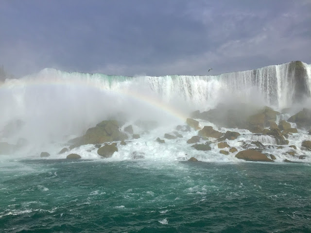
After that, I found some photo which are photo that I took in Niagara Fall and it shown movement , mountains from Grand Canyon and it show rhythm and some glass flower that I took from glass gallery and it shown harmony.


At the last I chose the Niagara Fall to be my final because I think that it shown more obvious in movement.


04/10/18
Our task for this week is doing an artwork by using any material that we had used before. At first I got no ideas what can I do. When I was rolling at my phone gallery, I saw a photo which I'm holding an ice cream. At the moment, I knew what I going to do which is draw an extra big and extra much ice cream to attract attention.

Figure 6.11: The photo that I found in my photo
I started add many flavour of ice cream in there which are cookie ice cream, mint chocolate, vanilla, chocolate, coffee and etc. After that, I decided to draw a hand and cherry then is smaller than those ice cream to show scale.

Figure 6.12: I drew the hand that showed in this photo
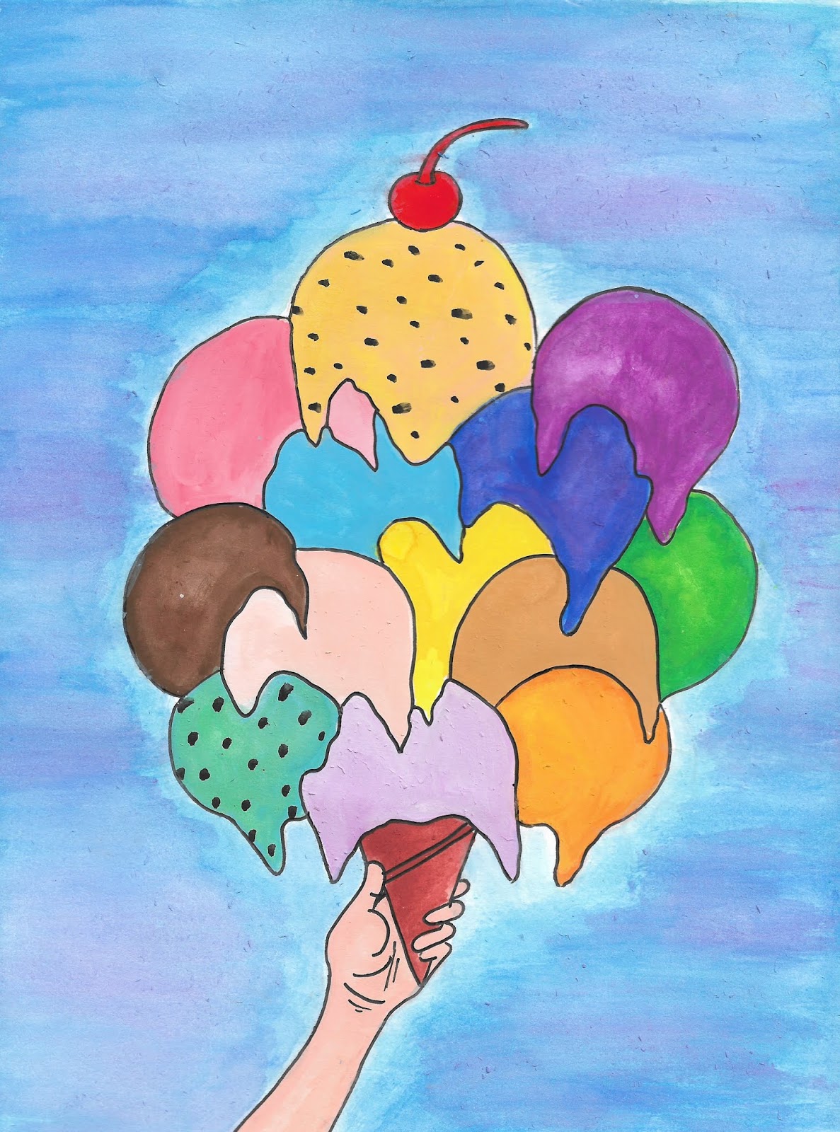
Figure 6.13 : This is the result that came out
HARMONY, MOVEMENT, RHYTHM
Week 0709/10/18
This week, we given a task which are create an artwork that shown harmony, movement, rhythm by using photography. At first, I was a bit confused about those principles then after I saw some of my classmates' work, I slowly understand what it is.
At first I chosen some of my photography that I took long time ago that shown harmony. While I looking at those photo, I think that maybe I can combined some of the photo to show movement. After that, I told Ms Anis and Ms Sherry about my ideas and they said it might not a good idea so I changed it.


Figure 7.11: Photos that I want to combined
After that, I found some photo which are photo that I took in Niagara Fall and it shown movement , mountains from Grand Canyon and it show rhythm and some glass flower that I took from glass gallery and it shown harmony.


Figure 7.12 : Those photo that I choose
At the last I chose the Niagara Fall to be my final because I think that it shown more obvious in movement.

Figure 7.13: My final photography that I chose for the movement principles
FOGURE/GROUND & SHAPE/FORM
Week 08
18/10/18
Ms Sherry want us to create something that represents figure/ground or shape/form artwork by using any material and tools. So this week I decided to create figure/ground by using photography because I think that using photography is the best ways to represent it.
Once I know I have to do figure/ground, I try to take some photo that are blur at the ground and clear at the figure. So I have take some photo of it and I decided to the coconut water that I took at Thai Thai restaurant. After that, I decided to choose a photo that I holding an ice cream as my final. This is because there shown more obvious on figure and ground when compare to other.


Figure 8.11: Photos that I tired to get figure/ground
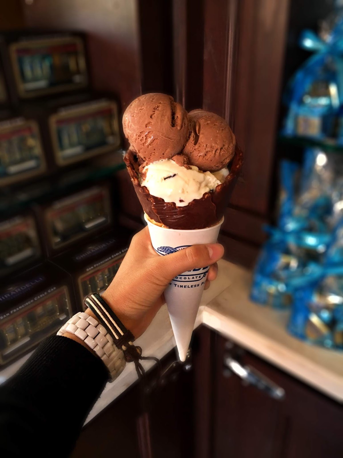
Figure 8.12: My final of figure/ground
PROCIMITY, PROPORTION, PERSPECTIVE, UNITY, VARIETY
Week 09
25/10/18
This week we have to create an artwork by any materials we want to use. At first I want to draw out an artwork which related to perspective but I found out that it is quite hard to draw out. Even thought it is quite hard, I still try to found some photos that I have took before this.


Figure 9.10: Photos that I took at New York City and Pulau Langkawi that shown one point perspective
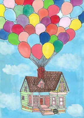
After I give up on perspective, I try something else which is variety. When I think of variety the thing that pop up in my head are balloon and think of balloon make me remember a Disney movie which is "Up". There are many balloons on the top of the house just to let the house float in the air. So I draw out the house and balloon on top of it.


Figure 9.11: The Disney Movie - "Up"

Figure 9.12: The house that the movie taking about.

Figure 9.13: My first attempt of variety

Figure 9.14 : My final attempt of variety
SKETCHES IN E-LEARNING WEEK
Week 11
06/10/18 - 08/10/18
This week is E-learning week and Mr Sherry give us a task which is sketches. We can to sketch anything we want or anything that we see. For the sketches, I decided to sketch those bear that in my car because I saw them everyday.
After I sketched those bear, I felt like I want to sketch something else, something that I never try before which is food. Due to this, I decided to sketch my brunch which is a Chinese Food named "Lou Shu Fun" (Sliver Needle Noodles). Before I eat, I took few photo of it just in case the noodle became cold after I finish my sketches.


Figure 11.0 : The things that I want to sketch.


Figure 11.1 : The sketches that I did.
PROJECTS
PROJECT I : SELF PORTRAIT
Week 07 - Week 09
09/10/18 - 23/10/18
In this few week, Mr Sherry give us a project which is our self portrait. We can use any material or ways to create our self portrait.
About the self portrait, I was thinking draw myself out. This is the second time I draw human by my self. So in the first week, I try to find some of my photo to draw and I choose two and I'm deciding drawing which one. At first I tried to draw the one that I'm at the beach but I found out it is too hard to draw so I decided to draw another one.


Figure 10.0 : Photo that I choose to draw

Figure 10.1 : Portrait that I draw at first
After I finish drawing my self portrait, I start to think what methods should I use to put colour on it. While I searching online, I found a fun way which is "Finger Painting" just like the one we always do in childhood. After that, I found some artwork which are using finger to paint it. After that, I started to paint my portrait using my finger.

Figure 10.2: Zara Forman using finger painting to paint her art work

Figure 10.3 :Cluck Close creating a finger painting of his grandmother-in-law


Figure 10.4: Some example of finger painting artwork


Figure 10.5 : Progress that I finger painting my self portrait

Figure 10.6 : Colouring the background


Figure 10.7: First attempt of my self portrait

Figure 10.8: My final attempt of self portrait
PROJECT II : POSTER
Week 08 - Week 10
16/10/18 - 30/10/18
In this few week, we have to take some photography at a place that we always went to. This is because we can always go there and take photo and no need to go some ways that are far away from us. After hearing the instructions of the project, the place that I thinking about are Starbucks, Bandar Puteri Drive-Thru. This is because I work at there as a part time barista and I work there every weekend so I can go there and take some photography when I am free. In Starbucks, there are only some place that we can't take photo so I avoid those place.
In the first week, I take some photography at there after I finish work. After I went back and I found that there are some photo that I took are not nice, so I went there again to take some nicer photo at the second day. After that, I edited the colour of those photos because I want it look more contrast.


In the photo that I took, there are some design principle which are contrast that I took the logo at the night. After that, I combined all the photo that I choose in Adobe Photoshop and I started working on it. In my poster, there are few design principle too which are contrast, hierarchy, direction and also edge alignment.


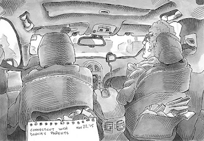


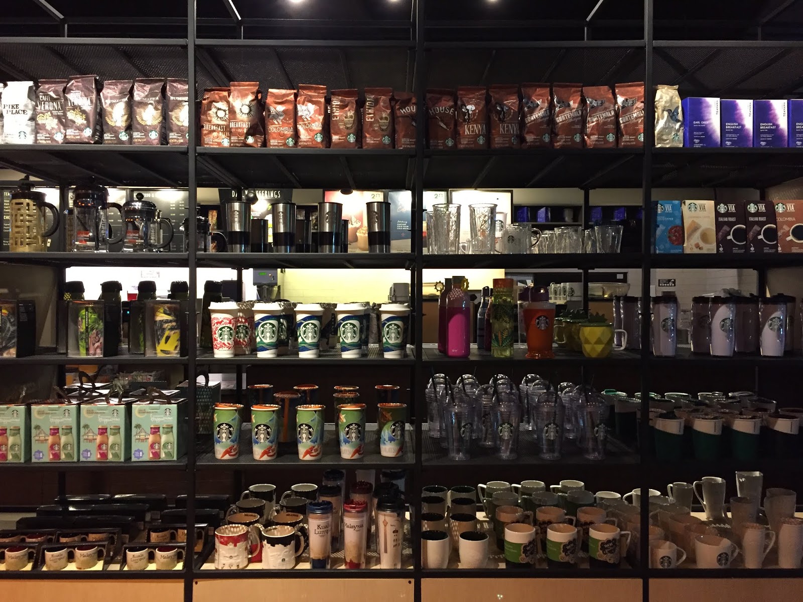


Figure11.0: Those photo that I took for the poster


Figure 11.1: Photos that I choose to create and I have edited for the poster
In the photo that I took, there are some design principle which are contrast that I took the logo at the night. After that, I combined all the photo that I choose in Adobe Photoshop and I started working on it. In my poster, there are few design principle too which are contrast, hierarchy, direction and also edge alignment.

Figure 11.2: Final result of the poster
FINAL PROJECT : BILLBOARD
Week 11 - Week 14
06/11/18 - 29/11/18
For the final project, we have to create or draw something that get inspired from the billboards. Nowadays, we can see many billboard beside the road, highway or even at the bridge that across the road all the way.
At first, I get confused about what Ms Sherry want us to do for the final project because I don't really understand the instruction. I thought we have to make a billboard or even drawing something that must have billboard in there. After I make some conversation with my friends and lecturer, I finally know what to do and it is not complicated that I thought before and I started writing down my ideas. After writing down my ideas, I decided which one I going to it.


Figure 12.0: Rough sketch of my ideas
Once I know what I have to do, I started capture the billboard that I can see while I driving. While I doing it, I realised something which the billboards that we always saw it beside the road can found it online too. This make me related to something that about generation. Before the phone come out, people will see what happening around them but now the new generation all look at their phone even though they are driving. It make me want to do a drawing which have two different generation sitting in the car, one look at the billboard and another are looking at the phone while driving. Not only that, the one who are looking at the phone are looking at the same things as the billboards.


Figure 12.1: Some billboard that I capture while I am driving
After I decided what I want to draw, I started thinking about how I going to show the view. I research some sketches and phone to decide what perspective that I want to show.


Figure 12.2: Sketches that I research


Figure 12.3 : Image that I research
After doing few research, I decided to use the view from driver side which can see the driver's hand, passenger and also the view that outside the car. This is because it can show the phone, old man and all the billboard. I started sketching the background which is the interior of car by using my own interior car design.

Figure 12.4: Trying with the angle

Figure 12.5: The angle I want and with my hands in it

Figure 12.6: My sketch for my car
After I sketched my interior of car, I started draw it at Adobe Photoshop. This is because I want to mix my material of my artwork. I was plan to use Adobe Photoshop to draw and colour the car ,the old man and the background. For the billboard and phone, I plan to use college to create it.

Figure 12.7: Drawing at Adobe Photoshop


Figure 12.8: Colouring it on Adobe Photoshop

Figure 12.9: Adding shadow

Figure 12.10: Printed artwork
After I printed my artwork, I have to decided what billboard that I want to put on it. I do some sketches and research of attractive billboard online because my artwork are quite dull colour and I didn't have chance to capture it on the road so I search it online.

Figure13.0: Sketches that I do to get ideas of billboard
While during the research, I found out that mostly attractive and attention grabbing billboard are about food. So I decided to do food as well and the food that I choose is "Ice Cream". This is because ice cream can be many type and colourful. I used old magazine to found some colourful colour and I found out that I got a magazine which have a lot of yellow and orange colour so I decided to use it to create an Mango IceCream with someone licking on it.


Figure 13.1: Billboards that eye catching are mostly about food


Figure 13.2: Doing the college by using old magazine
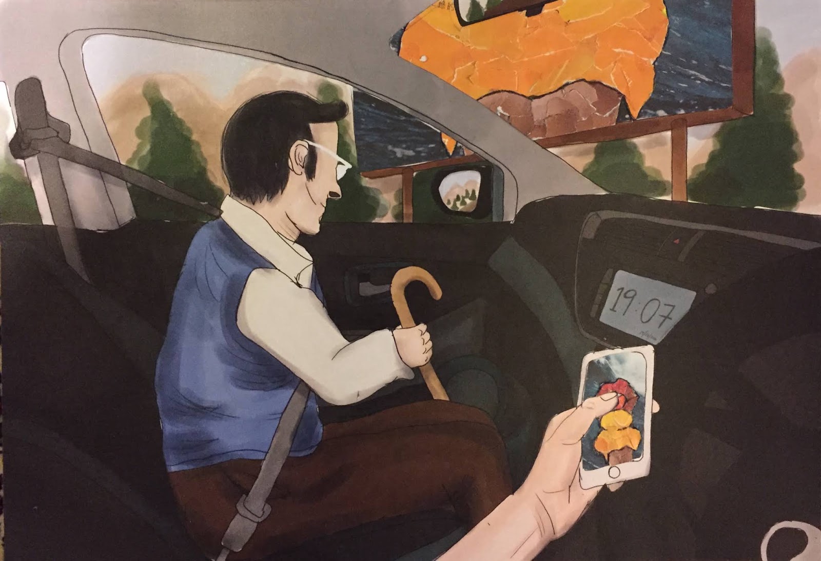
Figure 13.3: Final outcome of my final project
FEEDBACK
Week 01
(27/08/18)
CONTRASTMs Sherry said that my contrast about the artwork is there but maybe the flower are too big so that the attention to the leaf is quite low if compared to the flower.
Week 02
(04/09/18)
GESTALTThe feedback about this week artwork are quite many. At first the feedback from Ms Anis about the coconut tree is not bad because it is continuation gestalt. Next is about the brain and broccoli, she said that its good because she thought it is just a human head and after that she said she saw a broccoli in the head.
The feedback from Ms Sherry are both are not gestalt enough because she can see the picture by visual and not like figure & ground gestalt principles. Due to this, I do another artwork to improve myself.
The final feedback for the coffee and smoke are gestalt is there and they can see the cup and a human face at the same time but for the smoke, they said it is quite obvious because they see the brain first then only the smoke. Ms Sherry said it is a bit creepy because she felt that the brain will fall because of drinking coffee.
Week 03
(13/09/18)
SYMMETRY, ASYMMETRY, BALANCE & DOMINANCE PRINCIPLESMs Sherry give some comment about the sunset and it is she said that the overall of sunset is symmetry but maybe because of the watercolour so it make it not look symmetry enough. For the burger, Ms Sherry said that it is symmetry but it is quite empty and I may add something in there. Ms Anis suggested me to add a plate and maybe a red & white colour tablecloth to make it more interest.
The feedback about the final burger is good because it add some background inside and not just a burger in the middle.My classmates said that it is symmetry and most of them said they are hungry when they saw my burger because it look really like a burger that ready to get eat.
Week 04
(18/09/18)
PATTERN, REPETITION, TEXTURE & SURFACE PRINCIPLESThe feedback that given by Ms Sherry is she it is quite nice because I use the onion the make the wave and it look like pattern. Besides that, she also mentioned that maybe I can try to add other element to make the artwork more interest rather than just use onion to make the wave.
Week 05
(25/09/18)
ALIGNMENT, HIERARCHY, PLACEMENT, DIRECTIONMs Sherry said my "Mike" have centre alignment and she said that she can see my patient when she knowing me doing this. Some of my classmates mentioned that the mike is cute and they also said that I got patient doing this because I have to tear the paper into very small pieces.
Week 06
(04/09/18)
DOT, LINE, SIZE, SCALEMs Anis give some comment for my "Ice cream". She think that the concept of scale principles is showed but not clear enough. After that, she also mentioned that maybe the cherry that on the top can be more bigger to make the artwork more better and more look like scale.
Week 07
(09/10/18)
HARMONY, MOVEMENT, RHYTHMMs Sherry and Ms Anis give me some feedback about my first attempt of the photography that I think it show movement by combined some of my photo. They told me that it is not a very good idea because it didn't show movement obviously.
After that, I choose another two photography that I think it shown movement and rhythm which are Grand Canyon and Niagara Fall. I shown it to my friends and they told me that the mountain in Grand Canyon didn't shown much rhythm but the photography of the Niagara Fall does show more obvious movement.
Week 07 - Week 09
(09/10/18 - 23/10/18)
PROJECT I (SELF- PORTRAIT)There are many feedback for my self portrait. First is from my family, I shown it to my family first and they told me the overall is fine just maybe the eyes are a bit too big for the real me.Second is from my friend, he give me some advice about the ice cream. He told me that the colour of the ice cream are a bit similar to my skin colour so he ask me to change it but I didn't do that.
After that is the feedback from Ms Sherry. Ms Sherry told me that my ice cream colour are similar to my face so that my face didn't show up obviously. She also give some feedback for the outline of my self portrait. She said that maybe I can make the outline of my hand and shirt more clear even thought I am using finger painting.
Week 08
(18/10/18)
FIGURE/GROUND , SHAPE/FORMThere are few feedback for my both attempt of figure and ground. The feedback for the first attempt from my friends are the coffee bean jar didn't show up enough because the colour are similar to the background colour. Besides that, I shown the coffee bean jar to Ms Sherry and she said it is ok but I can improve more.
Week 08 - Week 10
(16/10/18 - 30/10/18)
PROJECT II (POSTER)There are many feedback for my poster too. First I shown it to my family and they said that it look natural and the colour are quite show up due to the background and the light of Starbucks Logo. After that, I shown it to my friends and they said that it is quite nice because of the light and the colour of my poster. Besides that, Ms Sherry also give me some feedback which she said the colour mixing of the poster are quite nice and the composition are quite nice too.
Week 11
(8/11/18)
SKETCHES (E-LEARNING)The feedback that given for my sketches from everyone are great. Mr Sherry said it is a nice work and she said that its quite nice because the sketch of my bears have shadow on it and for the food's sketch, it is not bad but I can improve more on it. There are also some feedback from my friends, there said my sketches is nice because I actually draw out the right perspective for those bear.
Week 13
(22/11/2018)
BILLBOARD (IDEAS)
Ms Sherry think that my ideas is acceptable because it relate to billboard and it also my perspective about billboards. Not only that, there are feedback from my friends too. Some of that think it was interesting and fun because they think that the way I show is quite nice. But some of my friends think that it is complicated because I have to draw the interior of the car, the old man and also the billboards which outside the car. They are curious about how I am going to draw it out.
Week 14
(27/11/2018)
BILLBOARD (SKETCHES AND PROCESS)
I show Ms Sherry my sketches and process and she give me some feedback which are she think it is quite good and she said it is interesting because she know I am going to do the college for the billboard and phone. She also mentioned that it might be hard to do college on the phone because the phone screen area are quite small.
After that, I show my process to my friends and ask them what they see from the drawing. Some of them said the old man are looking at outside the window and the driver are not paying attention when he/she is driving. Some of them said the old man are looking at the side mirror and it is quite true because I realised that the way I draw the old man head are a bit too low so it make it look like looking down instead looking up to the billboard. After I explained my ideas, most of my friends think that it is a good ideas and I does show the view that I want to show.
Week 14
(29/11/18)
FINAL PROJECT - BILLBOARD
There are some feedback about my final project which come from Ms Sherry and my friends. Ms Sherry said that she like the colour of it because it look like watercolour even though I colour it at Adobe Photoshop. Besides that, Ms Sherry does mentioned that the glasses of the old man are weird because it look like he wearing the glasses aside. After showing Ms Sherry the actual artwork, she said it look most different from the photo and she think that the college that I did for the billboard and phone is quite nice and I does show contrast on it.
There are also some feedback from my friends which they said it is nice especially for the college of billboard and phone. They said there are so nice to touch it because it have texture on it. Not only that, one of my friend told me that I have actually improved my drawing skills a lot in this few week.
There are also some feedback from my friends which they said it is nice especially for the college of billboard and phone. They said there are so nice to touch it because it have texture on it. Not only that, one of my friend told me that I have actually improved my drawing skills a lot in this few week.


Comments
Post a Comment