Typography's Final Project

07/11/18 - 21/11/18
(Week 11- Week 13)
Fong Ee Xuan (0332842)
Typography
Final Project - Typography: Expression, Hierarchy, Composition
LECTURE NOTES
Week 11
(07/11/18)
We don't have class in this week due to deepavali public holiday & E-learning Week.
Week 12
(14/11/18)
We don't have any lectures this week. We continued doing our final project and also our E-port folio which is blogger.
Week 13
(21/11/18)
We don't have lecture in this week due to it is the submission of the final project. After that, we got a senior which are having his last semester for his degree to give us a short presentation about his work that he had done in typography. He shown us the process from his research, sketches, digitisation and also his final project.INSTRUSTION
FINAL PROJECT
Typography: Expression, Hierarchy, Composition
For the final project, we were given a task which are express typographically a social messages which relevant to our campus - Taylor's University. We have to choose an appropriate typeface from the 10 typeface that given by Mr Vinod since the first project. Not only that, we only can use one more colour other than black and white. In this project, we have to ensure that the messages are occupied approximately 3/4th of the whole space.
The social message that I choose is stay fit by walking the stair. I choose this is because I realised that most of the student use the lift rather than walking the stair even though the class is just few floor away.
I started research some stairs poster or graphic poster which relate to stair or health. After that, I get some idea of doing it which I used words to create the thing. The typeface that I choose for the stairs is Univers LT Std Bold Condensed and the typeface for the foot print is Univers LT Std Extra Black.


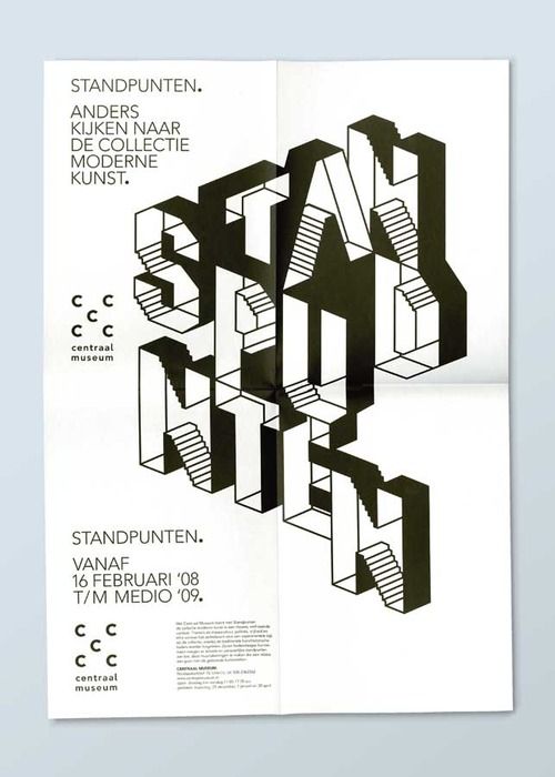


Figure 1.0: Some poster and graphic poster that I saved for the research

Figure 1.1: The rough attempt that before research and sketch

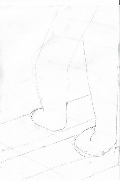

Figure 1.2: Rough sketches for my ideas

Figure 1.3: Trying to made it at Adobe Photoshop.

Figure 1.4: The Stairs

Figure 1.5: The foot print that fill with "healthy" words.

Figure 1.6: First attempt

Figure 1.6 : Second attempt

Figure 1.7: Third attempt

Figure 1.8: Editing another stair at Adobe Photoshop

Figure 1.9: Forth attempt

Figure 1.10: Fifth attempt

Figure 1.11: Sixth attempt ( Adjusted the composition of the stairs)

Figure 1.12: Seventh attempt

Figure 1.13: Final Outcome
After we finish our poster, we have to animate it by using Adobe Illustrator and Adobe Photoshop. Due to my poster is done by Adobe Photoshop so when I translate to Adobe Illustrator, there are few issues there so I decided to use Adobe Photoshop to edit it.

Figure 1.14: Issues that happen in my Adobe Illustrator

Figure 1.15: Animate it in Adobe Photoshop

Figure 1.17: First Attempt of GIF

Figure 1.18: Final Outcome of GIF
FEEDBACK
Week 12
(14/11/18)
The general feedback that given by Mr Vinod and Mr Shamsul for e-port folio is they want us update our further reading just like other as well, this is because most of us forgot to update further reading. Besides that, Mr Vinod and Mr Shamsul told us manage our time well because there are only one week left to the submission for final project. They also give us some advice for the final project which is we have to do some research before we start anything else. After that is sketches, we have to sketch our ideas out before we proceed to digitisation in computer. For the final project, we have to used all our knowledges from what we have learned previously such as exercises and other project to do our final project.
For my E-port Folio, there are some specific feedback that given by Mr Vinod and Mr Shamsul. They told me that all my post for project should be separate and not combining all in only one post. Besides that, I have to upload the thumbnail for my project 1. Due to the problem that happen in FontLab, I didn't upload it on my e-port folio and Mr Shamsul and Mr Vinod said it is ok. They told me to generate my font design again in Block D Level 7.
Online Feedback
Online Feedback
Due to it is almost the submission of the final project, I have to ask the feedback from Mr Vinod online. At first, I asked Mr Vinod about some of my idea which is I want to skew the word because I am trying to do the stairs by using words. Mr Vinod told me that it have to depends on the final result. After I tried out my idea, I shown it to Mr Vinod again and he told me that it is interesting and asked me to keep on working on it.
Week 13
(21/11/18)
Online Feedback before class: I shown Mr Vinod my three type colour of poster and I asked about the position of the slogan. Mr Vinod give me some suggestion which I can try add another layer of steps that going in a different direction would make the poster a lot more interesting.
In class, I shown Mr Shamsul my forth attempt of poster and he give me some feedback about it which he think that is interesting but he can't see the social messages that I want to show. So he give me some suggestion about it which I can write the social messages at the second layer of steps. After I changed the words, I show it to Mr Shamsul again and he said that the composition of the steps and social messages are not that good because the focus point in on the messages and not on the steps. I shown it again to Mr Shamsul after I changed the composition and he said it is much better and now I can try to align the step because it look a bit weird.
Due to Mr Vinod is quite busy, I only show the last edited poster to Mr Vinod and he said it is more interesting after I add another layer of steps but now the problem is the social messages that I shown are quite big. Mr Vinod give me some suggestion which I can try to make it look similar like the first steps that I have done but no need to be the same pattern.
Online Feedback after class: After I edited what Mr Vinod suggested, I shown it to him and he give me some feedback and suggestion to make it look better. Mr Vinod said that I can add my slogan below the second steps but I told him what Mr Shamsul told me before and he said it is correct and now I can try to fill the second step and then clip mask it so it won't look like the step is floating.
Online Feedback after class: After I edited what Mr Vinod suggested, I shown it to him and he give me some feedback and suggestion to make it look better. Mr Vinod said that I can add my slogan below the second steps but I told him what Mr Shamsul told me before and he said it is correct and now I can try to fill the second step and then clip mask it so it won't look like the step is floating.
REFLECTION
EXPERIENCES
Week 11 (07/11/18)
I felt a bit relax and stressless because this week is e-learning week and week we didn't have any face-to-face classes. I also get some idea while during the "holiday".
Week 12 (14/11/18)
I felt stressful during and after the class because Mr Vinod told us that we only have 1 more week to do our final project. Not only that, I felt stressful because I didn't get the ideas that I want on the project and I can't think of new ideas.
Week 13 (21/11/10)
I was kind of worried in this week because all those final project come together and I scare I didn't get what those lecturer want and I worried that they will decline my project even thought I tried hard.
OBSERVATION
Week 11 (07/11/18)
I realised rest and hangout with friends is also important when i felt stress on something because it help me to get some new ideas sometimes.
Week 12 (14/11/18)
I noticed that I get stress easily when I can't get new ideas and I also realised that time management are really important specially when doing those final project because if I didn't manage the time well, I can't do much things.FINDINGS
Week 11 (07/11/18)
I found out that it is ok to have some rest sometimes because when I work too much on somethings, it make it more worse and I can't think new idea if I keep force myself to think.
Week 12 (14/11/18)
I found out that management time is really important when doing somethings because it might or it will influence the results that come out.FURTHER READING
Week 11 - Week 13
(07/11/18 - 21/11/18)
"The Typography Idea Book: Inspiration From 50 Masters" by Steven Heller & Gail Anderson


Figure 1.: The Typography idea book by Steven Heller & Gail Anderson
The authors for the book are Steven Heller and Gail Anderson. Basically this book is told us how to make great typography and it is the inspiration from 50 masters. There are few ways to make great typography which are communicate through letters, create typographic personalities, get inspired by history, explore it by using media and technique, create illusion and mystique, experiment with different style and form and also play and improvise.
In this book, it written that not every designer is good , much less a great, typographer but to be a great typographer, we have to be a highly skilled graphic designer in the first place. Typography is the most important component of graphic design because it requires a distinct ability to make readable messages while we expressing, emoting and projecting concepts to audiences, large and small. Typography can be copied and it also can be taught just like the classical painting student who learn to rendering of human form by repeatedly drawing from the same plaster cast. So, same as typography, the best way to learn it is to do it over and over again. Practice is more important than theory because need to develop a visceral feeling about the way letters sit on a page or screen. Not only that, the typography that designed must be understandable even though it is a joys by playing with typographic puzzle pieces. And there are also an important note which are that doesn't necessarily mean legible for illegibility is relative and what is illegible can often be deciphered.
This book can help you evolve different typographic characters or styles or even though your specific design signature. This book have many existing volumes that will give us the essential knowledge and not just the typographic basics.


Comments
Post a Comment