Advannced Typography's Project I
(Week 06 - Week 08)
Fong Ee Xuan (0332842)
Advanced Typography
Project I
LECTURE NOTES
LECTURE 06: FINDING INSPIRATION - TYPEFACE DESIGN
Week 06
(07/05/2019)
Our classmates was presented the lecturer - "Finding Inspiration - Typeface Design" on this week. Here are the slide.
LECTURE 07: DESIGNING TYPE
Week 07
(14/05/2019)
One of our group of classmates did a presentation on "Designing Type". Below are the slides of the presentation.
INSTRUTION
PROJECT I
THE TROUBLEMAKERS MANIFESTO (KEY ARTWORK)
Week 06 - Week 08
(07/05/2019 - 21/05/2019)
For the Project I, our topic is "Troublemakers". We started this project by looking for an appropriate image to represent the troublemaker and to create a significant key artwork which connect to the "The Troublemakers Manifesto". We were advised to apply what we have learn in those few week.
At first, when thinking of troublemaker, all I think was naughty, annoying and make people felt uncomfortable. So I found some image that make me felt uncomfortable but after I show it to Mr Vinod and I read more about the meaning of "Troublemakers", I only realised that troublemaker is actually a person who are have creative mind and it is not what I thought I was at the first.
I started with finding some image that have a bad guys look and also some colourful splash which to represent the creative mind.
Since I want to make it the mind look like creative mind so I use Adobe Photoshop to cut off the guy's head. After I finish editing in Adobe Photoshop, I started doing my key artwork on Adobe Illustrator.
I started with finding some image that have a bad guys look and also some colourful splash which to represent the creative mind.
Figure 1.0: Image of bad guy
Figure 1.1: Colour splash
Figure 1.2: Guy after editing in Adobe Photoshop
Figure 1.3: Process of making the key artwork
Figure 1.4: First Attempt
Figure 1.5: Second Attempt
After showing the first and second to Mr Vinod, he told me that the key artwork will be better if I use the silhouette of the guy. After I create a key artwork, lecturers and I think that it will be nicer if I make another guys's silhouette and mask the colour splash and the silhouette together.
Figure 1.6: Third Attempt
Figure 1.7: Forth Attempt
Figure 1.8: A random guy that I search online
Figure 1.9: Combination of the random guy and the bad guy's silhouette
Figure 1.10: Process of masking the silhouette and colour splash
Figure 1.11: Clipping mask for silhouette and colour splash
Figure 1.12: Finding the suitable typeface
Figure 1.13: Fifth Attempt
Figure 1.14: Sixth Attempt
After creating all those key artwork, I think that it is a bit messy even though it is colourful. I showed it to Mr Vinod and he think the same. He do show me some better example and asked me to try and explore it.
Figure 2.0: Process of exploring the example that Mr Vinod suggested
Figure 2.1: Seventh Attempt
Figure 2.2: Eighth Attempt
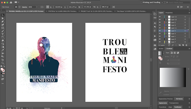
Figure 2.3: Final attempt of key artwork
Figure 2.4: Embedded PDF of Final Key Artwork
FEEDBACK
Week 07
(14/05/2019)
For our general feedback, Mr Vinod asked us to read more about troublemakers and also imagine we are the troublemakers and think what he/she will do while we doing the Project I.
For my specific feedback, I didn't have process to show it to Mr Vinod since I haven't get my laptop back and my work didn't save. Hence, I show the image that I have pick for the project and Mr Vinod and Mr Shamsul said that the image is not represent troublemakers enough and we shouldn't use the image to show the characteries of the troublemakers.
Week 08
(21/05/2019)
Mr Vinod and Mr Shamsul give me some feedback for my key artwork. Mr Shamsul said that i need to interpret the word more and I should put the hightlight on the word "troublemakers" and not the "the".
The feedback that i get from Mr Vinod was he think that my key artword are colourful and he kind of understood it. Not only that, he also give me some suggestion which he think the colour can explore from the bad guy back and maybe I no need the real guys there, so i can just replace it by putting the silhouette.
Online Feedback
After I create another key artwork which i mask the silhouette and colour splash together, i showed it to Mr Vinod through facebook and this is feedback from Mr Vinod:"I think its better, but the typo interplay isn't."
Online Feedback
After I create another key artwork which i mask the silhouette and colour splash together, i showed it to Mr Vinod through facebook and this is feedback from Mr Vinod:"I think its better, but the typo interplay isn't."


Comments
Post a Comment