Advanced Typography's Final Project

28/05/2019- 03/07/2019
(Week 09 - Week 14)
Fong Ee Xuan (0332842)
Advanced Typography
Final Project
LECTURE NOTE
Week 10
(04/06/2019)
We don't have lecture this week due to Hari Raya Holiday.LECTURE 11: TYPRGRAPHY IN DIFFERENT MEDIUM
Week 11
(11/06/2019)
This week is my group's time to present. Our topic is "Typography in Different Medium". Here are the slide that my group have done.
LECTURE 12: PERCEPTION AND ORGANIZATION OF TYPOGRAPHY
Week 11
(11/06/2019)
Not only that, there are another group presented another topic which is "Perception and Organization of Typography". Here are the slide that have been presented.Week 12
(18/06/2019)
We don't have lecture on this week as we continued our final project.Week 13
(25/06/2019)
We don't have lecture on this week too as we still continued our final project.INSTRUTIONS
FINAL PROJECT
DESIGN, EXPLORATION AND APPLICATION
Week 09 - Week 13
(28/05/2019 - 25/06/2019)
In this project, we are free to choose our topic as long as it have a purpose or it can solve a problem. We were required to used all our knowledge and experiences that we gained from the exercises, Project I and Project II. Before we started everything, Mr Vinod showed us some example.
Video 1.0: Example that given by Mr Vinod


Figure 1.0: Cake Typography from https://asubtlerevelry.com/typography-cake/

Figure 1.1: Experimental Typography from https://ronykoch.myportfolio.com/experimental-typography-1

Figure 2.0: Chinese Calligraphy

Figure 2.1: Chinese Calligraphy's strokes
After I show Mr Vinod my ideas, he asked me to think about another ideas since there are already 5 students in the class are doing the similar project. After that, I have think about another project which is Ice Cube Typeface. I know there are Ice Words Tray exist is world but I want to change it into some typeface that are more interesting which I gonna included ice cube's characteristic in words.

Figure 2.2: Ice Cube Tray

Figure 2.3: Ice Typeface Tray


Figure 2.4, 2.5: Ice characteristics (Shape)
I choose Ice Cube Typeface as my idea is because I realised that nowadays, there are many people are using their mobile phone even though they are having a gathering with friends, having dinner with family or even two couple are hanging out. Due to this reason, I want to create an Ice Cube Typeface so that people will get more attention to their beverage and not the phone.
I started with sketches. I sketched some fonts with Ice characteristics in my sketch book. After I decided what I want to do, I started doing it on Adobe Illustrator. I used pen tool to draw the layout of the Ice shape and put it at the typeface.

Figure 3.1: Process of drawing the ice layout

Figure 3.2: Ice Layout (Screen shot)

Figure 3.3: Ice Layout

Figure 3.4: Original font A - J (Arial Rounded MT Bold)

Figure 3.5: Original font K - T (Arial Rounded MT Bold)

Figure 3.6: Original font U - Z (Arial Rounded MT Bold)


Figure 3.7, 3.8: Process of creating first attempt of Ice Typeface

Figure 3.9: Process of creating first attempt of Ice Typeface #1

Figure 3.10: Process of creating first attempt of Ice Typeface #2

Figure 3.11: Process of creating first attempt of Ice Typeface #3

Figure 3.12: First attempt of Ice Typeface #1

Figure 3.13: First attempt of Ice Typeface #2

Figure 3.14: First attempt of Ice Typeface #3
After I create the ice typefaces, I try to put it on an ice tray and see the outlook.

Figure 3.15: Trying the put the ice typefaces on ice tray #1

Figure 3.16: Trying the put the ice typefaces on ice tray #12
After I done my first attempt, I show it to Mr Vinod and Mr Shamsul. They told me that it will be very hard to create the ice when my typeface's strokes are too thin.
So I decided to create another new typeface which have a thicker strokes and this time I going to look at some fonts to be my reference. I went to GoogleFonts to take a look and I realised there are a font that similar to the font that I want to create which is "Iceland". For me, the characteristic of this typeface are it is square and it look like an ice cube.

Figure 4.0: Iceland that I found at GoogleFont
After I found that the "Iceland" font is suitable for the ice cube font, I downloaded it into my laptop and start illustrate it on Adobe Illustrator. I combined the characteristic of the ice with the font. I choose few words to be the Ice so that they can read it while they having the beverage. The words that I chosen is "BEACH".

Figure 4.1: The Iceland's font (A - Z)

Figure 4.2: Process of illustrate the Ice Cube's font

Figure 4.3: Creating the Ice Cube's font for the "BEACH"

Figure 4.4: "BEACH" using the Ice Cube's font
Figure 4.5: Embedded PDF of "BEACH" using Ice Cube's font
After I finished creating the Ice Cube's font, I started making the mold of the ice cube. I used the modelling clay, cutter, cardboard and water to make the ice. At first, I printed out the words that I want to do and cut it on the card board. After that I chopped the card board on the clay so that it have the shape of it. I pour some water in the mold and put it into freezer.

Figure 5.0: Thing that I prepared for making the mold


Figure 5.1: The words that I choose


Figure 5.2: Words after been chop

Figure 5.3(a): "BEACH"

Figure 5.3(b): "BEACH"

Figure 5.4: With ice in it

Figure 5.5: I put it into freezer

Figure 5.6: After it become Ice Cube
I did it another attempt since the first one are too thin and all the ice cube crack.
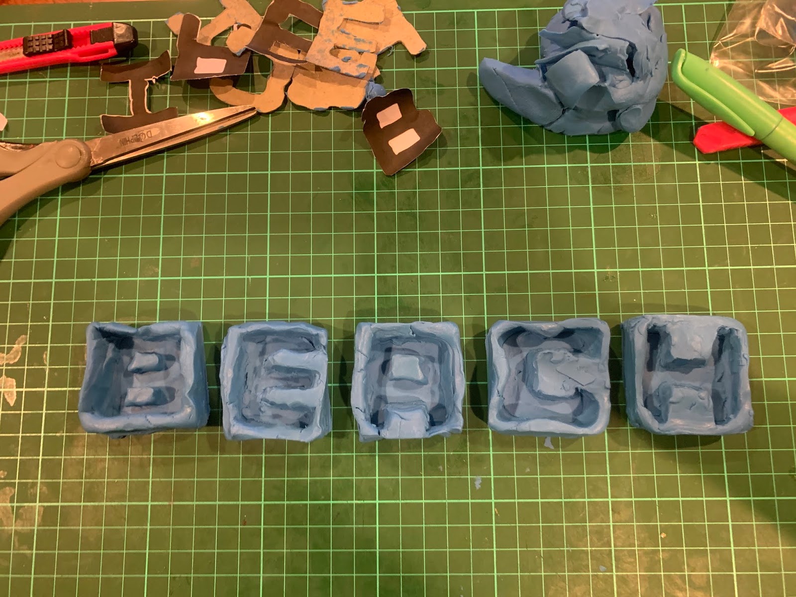
Figure 6.0: Second attempt of the ice cube mold

Figure 6.1: The Ice cube after one and half hour

Figure 6.2: The Ice Cube with "BEACH" words
Vid 1.0: Putting the "BEACH" Ice Cube into the beverage

Figure 6.3: The "BEACH" Ice Cube inside the beverage (Top View)

Figure 6.4: The "BEACH" Ice Cube inside the beverage (Side View)
FEEDBACK
Week 09
(28/05/2019)
The general feedback that given by Mr Vinod are he suggested us to show our artwork to random people who are not studying design or designers to see whether they can get the information properly.
After Mr Vinod saw my key artwork once again, he suggested me to explore more because now i just putting the words - "The TroubleMakers Manifesto" around the artwork that i did. After i create another two key work, i showed it to Mr Vinod again and he said that the words attempt is not bad and for the people attempt, he think that i should play around witht the colour. I showed it again to Mr Vinod after i change the colour and and adding the " Manifesto" word in the key artwork. The feedback that he give is he think it is much better and maybe i can change the type of it. Not only that, Mr Vinod also give some feedback for the poster. He said he like the axial system that i apply on the poster and he think i can make the key artwork bigger and put the information in and outside of the key artwork.
Week 10
(04/06/2019)
Mr Vinod commented on the feedback form and wrote: "Your collateral has no consistency in use of type. You need to ensure the identity of your design is maintained across the different collateral."Week 11
(11/06/2019)
General Feedback: Mr Vinod and Mr Shamsul told us that our blog's image have to be "jpeg" and also we have to update our keyartwork for out both project I and II. The feedback from Mr VInod for our group presentation is he think we did a good job and the topic that we present is a interesting topic. Not only that. Mr Vinod do give us some advise which he want us think about the problem, solution and how the work gonna look like when we thinking about our ideas for our final project.
Online Feedback: I show Mr Vinod about me frist idea which i want to combine chinese calligraphy and english typefaces but Mr Vinod told me that there are already 5 students doing this project and he ask for another idea. After I told Mr Vinod my second idea which i want to use the ice tray and make it into alphabet, he did give some feedback about it. He asked how can mine going to be different than the one we can search it online.
Week 12
(18/06/2019)
After i show Mr Vinod and Mr Shamsul my final ideas which i want to create a type and make it into ice cube, They give me some feedback which they think the idea is ok and i can start creating the typeface. Not only that, they suggested me to use clay to make the ice out and after i finish, i should take a nice photo of it by using a nice lighting.
Week 13
(25/06/2019)
The feedback that i get for my poster is they think it is nice and not bad. Not only that, I showed my first attmept of "Ice" fonts to Mr Vinod and Mr Shamsul and they think it is ok but it will be hard if i want to make it into ice because the strokes is quite thin for an ice cube. They suggested me to create a typefae by using a square. After i create another typrface and i showed it to Mr Vinod and Mr Shamsul, they said it is still hard when i want to create the ice but Mr Vinod like the typeface that i create for the Ice fonts.
REFLECTION
EXPERIENCES
Week 09
(29/05/2019)
I feel exhausted when I keep changing my key artwork. Not only that, I felt a bit lost when Mr Vinod explaining the final project to us.
Week 10
(05/06/2019)
We are having a the Raya holiday on this week, I feel happy and a bit stress at the same time even though it is a holiday.
Week 11
(11/06/2019)
I feel a bit stress about the ideas for the final project because I can't think about any ideas.
Week 12
(18/06/2019)
I feel kind of excited and also stress because Mr Shamsul and Mr Vinod approve my ideas but my ideas - ice is kind of hard to create.
Week 13
(25/06/2019)
I feel exhausted because I found out that the ice cube crack easily and the clay is hard to take out.
OBSERVATION
Week 09
(29/05/2019)
I realised that making a key artwork is harder than I thought because I have to keep changing to find the better one. Besides that, I found that I did not get what we actually need to do in our final project.
Week 10
(05/06/2019)
I noticed that I feel stress because thinking an ideas for the final project is hard and it need a lot of time to explore it.
Week 11
(11/06/2019)
I noticed that it have to take time to think about our final project and have to look more typographic example to find some inspiration.
Week 12
(18/06/2019)
I realised that I think it in a difficult way which I keep thinking using silicone to create the ice cube tray and not just the clay to make it.Week 13
(25/06/2019)
I realised that when the clay is thick it hard to take out and the ice will crack easily is because I make the clay thicker than the ice and I didn't chop it deeper for the ice fonts.
FINDING
Week 09
(29/05/2019)
I found out that making a nice key art work have to be patient and we need to show it to other people so that we know the result of it.
Week 10
(05/06/2019)
I discover what we have to do on our final project and thinking an ideas need some inspiration.
Week 11
(11/06/2019)
I found out that looking for typographic examples and things around us do help me come out which some ideas.
Week 12
(18/06/2019)
I found out that if ice cube font is hard to create because it easier to break and it will melt every fast.
Week 13
(25/06/2019)
I discover that if the mold of the ice cube tray be more deep and the clay be more thin, it will be easier to take out and it won't crack easily.


Comments
Post a Comment