Interactive Design's Final Project
20/06/2019 - 04/07/2019
Week 12 - Week 14
Fong Ee Xuan (0332842)
Interactive Design
Final Project
LECTURE NOTE
Week 12
(20/06/2019)
We got no lecture today as we continued to discuss our final project with my project's partner.
Week 13
(27/06/2019)
We got no lecture today as we continued to discuss our final project with my partner.
Week 14
(04/07/2019)
We had no lecture this week as we continued to do our final project and upload the progress in our blog.
INSTRUCTIONS
FINAL PROJECT
CREATE WEBSITE FOR OUR PARTNER
Week 12 - Week 14
(20/06/2019 - 04/07/2019)
Last week, we were asked to choose a partner for our final project and we had to design a website for our partner. I paired up with Jennifer and we came up with our own content and exchanged it during class this week. Me and Jennifer both sketch our idea layout to each other so that we can make our life easier.
Figure 1.0: Rough sketches
Based on Jennifer's content, I have to create a blog for her which is about her works (Photography) and travel. We communicate with each other for our content and so on so that we know what to do for our final project.
At first I had create a moodboard and also some media that needed in the website. After that we started finding some template that we like and we shared it to each other. We started doing in on Adobe Dreamweaver after we decided every content.
The template that Jennifer and I choose for her website is air template from free css.com.We started doing in on Adobe Dreamweaver after we decided every content. Not only that, Jennifer also shared her information to me through Google Drive.
Here are the link for the air templates: https://dreamy-mcclintock-ce6930.netlify.com
Figure 1.1: Mood board #1
Figure 1.2: Mood board #2
The template that Jennifer and I choose for her website is air template from free css.com.We started doing in on Adobe Dreamweaver after we decided every content. Not only that, Jennifer also shared her information to me through Google Drive.
Here are the link for the air templates: https://dreamy-mcclintock-ce6930.netlify.com
Figure 1.3: The Air Templates
Figure 1.4: File #1
Figure 1.5: File #2
Figure 1.6: File #3
Figure 1.7: File #4
Figure 1.8: Process of coding the home page
Figure 1.9: Process of coding the contact
Figure 1.10: Process of coding "Work" page
Figure 1.11: Process of coding "Travel (Japan)" page #1
Figure 1.12: Process of coding "Travel (Japan)" page #2
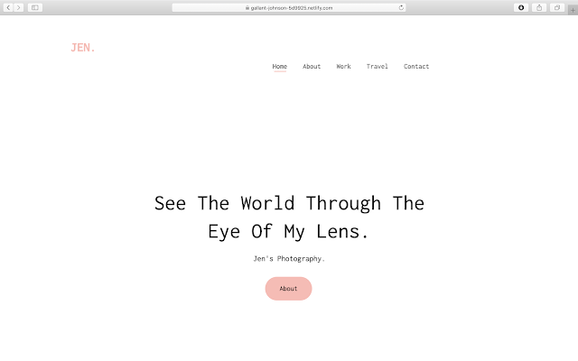
Figure 2.0: Final outcome (Home Page)
Figure 3.0: Home page #1
Figure 3.1: Home page #2
Figure 3.2: Home page #3
Figure 3.3: Home page #4
Figure 3.4: Home page #5
Figure 4.0: About page #1
Figure 4.1: About page #2
Figure 5.0: Work (Book Photography) page #1
Figure 5.1: Work (Book Photography) page #2
Figure 6.0: Work (Street) page #1
Figure 6.1: Work (Street) page #2
Figure 7.0: Travel (Japan) page #1
Figure 7.1: Travel (Japan) page #2
Figure 8.0: Travel (United Kingdom) page #1
Figure 8.1: Travel (United Kingdom) page #2
Figure 8.2: Travel (United Kingdom) page #3
Here are the final outcome of Jennifer's Website: https://gallant-johnson-5d9925.netlify.com
FURTHER READING
HOW TO DESIGN WEBSITES
Figure 9.0: The Book Cover
Chapter : Images and Colour Schemes
In here, I learn that light colour is inherently additive and pigment colour is inherently subtractive. A colour display on a monitor starts out black, and light is added to the screen to create colour. The more of the primary colours red, green and blue are added, the brighter and the lighter the screen becomes. At 100% intensity of red, green and blue, the screen is white. Regardless of the physics of how colour is created, whether it is transmitted or reflected light, most designers and illustrators will use colour on screen as if it were paint, i.e. pigment. It thus makes more sense to talk about red and green being complementary colours than red and cyan. The relationship between colours that you see on screen are exactly same as what you see in print. The primary colours of pigments are red, yellow and blue. The secondary colours are made from a mixture of two primaries : red and yellow make orange' red and blue make purple; yellow and blue make green. The tertiary colours are made from a mixture of 2 secondaries, or 2 complementary colours, such as red and green. Examples are olive green, maroon, and various browns.Not only that, a neutral colour scheme includes colours not found on the colour wheel such as beige, brown, white, black and grey. An accented neutral colour scheme is mainly neutral colours plus highlights of a brighter colour such as red.
Choosing a colour scheme is a highly subjective process. Your clients may have colours they prefer, in their logos or corporate identify branding for example, so you may be constrained and guided by these. You may want to use colours sampled from an image on your home page. You should be clear about your site's brand message and choose colours that reinforce it. For a financial institution, for example, use cool, muted colours such as blues, greys and greens, which convey stability and trust. On the other hand, a site aimed at a younger audience could make us of brighter, brushes, more saturated colours. Don't overdo the number of colours in your palette: three or four colours, plus white and black, should be enough. Too many colours can distract and confuse the user.


Comments
Post a Comment