Creative Brand Strategy's Project III
(Week 07 - Week 14)
Fong Ee Xuan (0332842)
Creative Brand Strategy
Project III
INSTRUCTION
LECTURE
Week 07
27/05/2020
Week 08
03/06/2020
This week, Ms Hsin gave us a lecturer about "Printing Technique & Surface Finishing" and she also share some of her collection of printing stuff with us to lets us understand more. Besides that, we have an individual consultation with her to show our progression from last week.
Week 09 10/06/2020
Week 10 17/06/2020
For this week, we don't have lecture as we show our progression to Ms Hsin. After that, we have a peer review in this week too.
Here are the presentation slide for peer review:
Week 11 24/06/2020
Week 12 01/07/2020
Week 13 08/07/2020
PROJECT III
CAMPAIGNS AND EVENT BRANDING
Week 08 - Week 14
03/06/2020 -
In this project we have to execution event branding that we have proposed last week which is the touchpoint in the customer journey map. This week, I started digitalise my application in more details since I have started sketched my logo, poster and so applications last week.
Figure 2.0: Screenshot that I working on my logo
Figure 2.1: Screenshot that I working on my logo, poster and other applications
After I get approved for my logo, I started design the key visual, social media post and ticket in more details. Not only that. I also work on icon, staff ID and others.
Figure 3.0: Screenshot of working on applications
Besides that, I relook for my window elements to make it more details and I made it into poster. I also search for some artwork that is interesting and suitable for George Town Festival to be my poster images. In there, I decided to choose 4 activities as main activities since I have 4 type of window.
Figure 4.0: Screenshot of working on poster
After I consulted with Ms Hsin, I change some of my poster, icon and application design. Not only that, I also started my animation with the very first steps which I started create the artboard for the "Window Opening" scenes.
Figure 5.0: Working on poster
Figure 5.1: Working on information board
Figure 5.2: Working on Guidebook
Figure 5.3: Working on 'Window Opening' scene on Adobe Illustration
Due to my icon always blend into my background colour, Ms Hsin suggested me to change my background colour into more brighter. So I changed my primary colour and secondary colour into a brighter yellow and blue. I apply it to my logo, background poster and other applications as well.
Figure 6.0: The updated colour palette
Figure 7.0: Finalised Logo
After I done my window opening scene, I started doing it on Adobe Animation to make other elements move as well. Not only that, I work more on guidebook which is the map.
Figure 7.1: Working on guidebook (map)
After I done few of my application, I started to find mockup for them and for other application such as guide map and animated social media, I keep working on it.
Figure 7.2: Working on mockup on Adobe Photoshop
Here are all the design that I did for George Town Festival:
Figure 8.0: Finalised Primary Logo
Figure 8.1: Finalised Secondary Logo
Figure 8.2: Finalised Typography that I used
Figure 8.3: Finalised Core Visual Language
Figure 8.4: Finalised Activities Icon (Core Visual Language II)
Figure 9.0: First Poster
Figure 9.1: Second Poster
Figure 9.2: Third Poster
Figure 9.3: Fourth Poster
Figure 10: Designs for curtain at the entrance
Figure 11.0: Design for Information board
Figure 11.1: Design for Information board II
Figure 12: Design for Staff ID and Photographer ID
Figure 13.0: Free Ticket's Design
Figure 13.1: Purchase ticket for Film's design
Figure 13.2: Purchase ticket for Theatre's design
Figure 13.3: Purchase ticket for Fashion's design
Figure 1.4: Purchase ticket for Talk's design
Figure 13.5: Purchase ticket's back's design (Yellow version)
Figure 13.6: Purchase ticket's back's design (Yellow version)
Figure 14.0: Social Media Countdown Post' design (9 days)
Figure 14.1: Social Media Countdown Post' design (8 days)
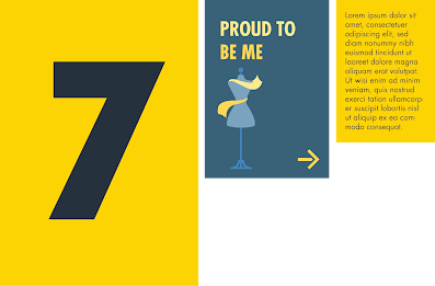
Figure 14.2: Social Media Countdown Post' design (7 days)
Figure 14.3: Social Media Countdown Post' design (6 days)
Figure 14.4: Social Media Countdown Post' design (5 days)
Figure 14.5: Social Media Countdown Post' design (4 days)
Figure 14.6: Social Media Countdown Post' design (3 days)
Figure 14.7: Social Media Countdown Post' design (2 days)
Figure 14.8: Social Media Countdown Post' design (1 day)
Figure 15.0: Guidemap's design (Outside)
Figure 15.1: Guidemap's design (Inside)
Here are the mockups for George Town Festival:
PRE-EVENT
Figure 16.0: Indoor Poster
Figure 16.1: Outdoor Poster
Figure 16.2: Outdoor Poster II
Figure 17.0: Social Media Countdown Post
Figure 17.1: Social Media Countdown' GIF
Figure 18.0: Social Media Post for Poster
Figure 18.1: Poster' GIF
DURING EVENT
Figure 19.0: Curtain for the activities entrance (Yellow version)
Figure 19.1: Curtain for the activities entrance (Navy Blue version)
Figure 20.0: Information Board
Figure 21.0: Free ticket for everyone who attend George Town Festival
Figure 21.1: Purchase Ticket' Front (Yellow Version)
Figure 21.2: Purchase Ticket' Back (Yellow Version)
Figure 21.2: Purchase Ticket's Front (Navy Blue Version)
Figure 21.3: Purchase Ticket' Back (Navy Blue Version)
Figure 22.0: Photographer ID
Figure 22.1: Staff ID
Figure 23.0: Guidemap' Outside
Figure 23.1: Guidemap' Inside
POST-EVENT
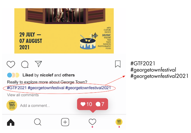
Figure 24.0: Hashtag for George Town Festival 2021
Here are my presentation slide for Pitch Deck:
Here are the Finalise Pitch Deck slide:
FEEDBACK
Week 08
03/06/2020
After I showed my progression, Ms Hsin gave me some feedbacks about it. For my logo, it is okay with the two types of fonts and for the smiley face, it feel welcoming after looking for awhile. Besides that, for my poster, Ms Hsin suggested me to try different image such as artwork of those artist. I could add more detail & layer for my window because it look too flat. Not only that, Ms Hsin suggested me for the window that are open, I could do it for printed poster and animation for the window that are not fully open. For my icon, Ms Hsin suggested me to let all icon carry the same colour like I did for the "Film" icon. Ms Hsin also suggested me that my information board could keep the number by itself and the icon, i could put it at another board which is the information board.
Week 09
10/06/2020
Ms Hsin gave some comments and suggestion about I showed my progression. For my icon, Ms Hsin ask me to relook my "Mic" & "Music" icon because it don't really match my other icon. Besides that, for my ticket, Ms Hsin suggested me to create more differences betwen the front & back view and the I should just include most of the information at the back of the ticket. Ms Hsin also suggested me to research more about ticket information to let me understand how it work. For my social media post whcih is the countdown post, Ms Hsin suggested me to make it animation like promo video becuase it will be nice and fun. Not only that, Ms Hsin also give me some advises for my poster which I should decrease the amount of dripping ink in the poster and the infromation of the poster could place at the corner of the poster or aside of the windowo because the window is the main elements in my poster. Lastly. Ms Hsin asked me to name my elements and colour so that people know how to call it.
Week 10
17/06/2020
Specific Feedback:
After I show my progression for this week, Ms Hsin gave some comment and suggestion about it. For my "Talk" & "Music" icon, Ms Hsin said it is more dimensional compare to the previous one. After that, Ms Hsin also commented on my poster that I have created. She said the big type face behind the window make my poster look like a scary movie and it is quite hard to read because it is too big. However, for the curve type, Ms Hsin said it look fine and I can go with it. Not only that, Ms Hsin also suggested me about the information which is move to the corner because it make the window look more focus. Ms Hsin also suggested me to find some image that is brighter to make it look more nice. For my staff ID, Ms Hsin said 2 and 3 look okay but it will be challenging to read the "volunteer" word for No.3. For my ticket information, Ms Hsin said it look great just the icon kind of blend in to the background so i might need to refine the icon colour. I did two type of social media post whcih is countdown post and information post. Ms Hsin said the social media post look great and not all the number need to have GTF logo. For my information post, Ms Hsin said the technic that I used for it is good just maybe the images look like it is introduction something so I need to relook for the images which didn't have addition messages such as hand.
Feedback from peer review:
There are three part of comment which is "What has done so far?", "What can be improved." & "What I curious about; what I don't understand".
"What has done so far?":
- Like the freeform look of the brand
- Love the illustrations and the colors, the consistency in the visuals very nice
- i like the colours, and the illustration for each activity is nice too
"What can be improved.":
- Colour pairing can be better. Maybe a brighter yellow and less grey in the blue?
- The visuals can have human body parts (hand/face) that are covered in paint as well instead of just vector paint shapes.
- I agree with the above comment. Looks a bit like they don't belong together.
- I think the composition and size of the type you could try more attempts so maybe it gives some space for posters and other applications.
"What I curious about; what I don't understand":
- Do you have many different shades of blue in your colour palette with the yellow? Or are you using the same one
Week 11
24/06/2020
To make my icon and other elements more outstanding, Ms Hsin suggested me to change my background colour into a more brighter colour. This is due to Ms Hsin told me that some of my application are kind of blend in with my background which create no contrast. For my staff ID, Ms Hsin said that staff and volunteer are kind of in a same section so I can just make it into two type of staff ID whcih is "Staff" and "Counselors" or maybe other. Not only that, it doesn't need to have too many type treatment for my staff iD. Besides that, Ms Hsin also suggested me to change my ticket background to the one that we decided early and make the icon more brighter to make more contrast. For my curtain, Ms Hsin told me that the very first design that I did look good and better than other because one of my design look like "YinYang" which I agreed with it. Ms Hsin told me that our application core purpose are our event. So for my guidebook, I should consider the food map as second and the location of those activities is my core of the guidebook. But Ms Hsin did said I can continue doing the food map and I can collabrate wth the illustrations that I found online. In the guidebook map, I could list out the activities' number and the description of it could place at the side of the map. For my poster moving, Ms Hsin said the idea that I have is cute which I make the window open slowly and she said I could start plan th sequence moving for other element. Ms Hsin also suggested me to do colour palette and also I have to consider about the space of the social media post that I planned to post.
Week 12
01/07/2020
After I show my progression to Ms Hsin, she gave me some feedback and suggestion on it. For my social media countdown post, Ms Hsin think the number of it should be the same colour as the background or else I make the colour more contrast. Besides that for my curtains, Ms Hsin suggested me to find some mock up so it show how it will work. For my guidebook (map), Ms Hsin said the icon are no necessaary to be on the map becuase the information at the side already have it, so that consumer will look at the information part. Not only that, Ms Hsin suggested me to make the map more longer so that I could combine both of the map which is the activities location map and george town food map. Besides this three application, my other application such as ticket, staff id, poster, animated poster all are good and fine. Ms Hsin also said that my adjustment on the colour are good now compare to previous times.
Week 13
08/07/2020
For this week, I showed my guidemap, curtains and animated social media to Ms Hsin. For my guidemap, Ms Hsin said everything is ok now and all the information for the location are fine as well just that i have to make it all align. After that, Ms Hsin said my mockup for the curtains is good enough just a bit changes for the curtains and the envoriment. Ms Hsin suggested me to put a black layer behind the curtains so that people will more focus on the curtains design. Not only that, Ms Hsin also suggested me to move the icon higher so that when it won't be block by other elements. For my animated social media, Ms Hsin told me to make it just one countdown days animated and the ideas is the dripping ink is falling down then the number appear after it.
Week 14
15/07/2020
After I presented my pitch deck to my classmates and Ms Hsin, my classmates said I used two colour through all the event which is interesting. For Ms Hsin, she gave me some feedback on my animatted social media countdown post. She said it is not what she expect but overall it still not bad and good. For my moodboard, Ms Hsin said that it is not so communicative through it and I should used raw image instead of artwork that done by someone else.
Here are the feedback that gave by Ms Hsin:
Concept & Design direction can be more communicative by highlighting the visual idea “window to the world of art”. Application outcome showed consistency in the usage of colors and overall mood, however the sensibility on setting the visual hierarchy can be improved. Do include the set of illustrative icons as part of your ‘Core Visual Language’, for it supports communicating the event activities. Try to polish up your skill and ideation on motion graphics in the future, you will need it.
FURTHER READING
Week 09 - Week 10
10/06/2020 - 17/06/2020
The 3D Type Book
by Agathe Jacquillat and Tomi Vollauschek
Figure 25.0: "The 3D Type Book" Book Cover
When I fond this book, I was mind-blowing. This book is very helpful as it consists of diversity of letters that can found in nature even in humans and it is amazing.
After reading this book, I get the point that design isn't just about pens and paper or even screens, it is actually everything that come from our daily objects which we don't even notice. This book gave me some examples which I think it is really interesting. Here are those example:
Figure 25.1: Example that gave
Figure 25.2: Example that gave
Figure 25.3: Example that gave
Figure 25.4: Example that gave
Figure 25.5: Example hat gave


Comments
Post a Comment