Publishing Design's Project II

(Week 04 - Week 08)
Fong Ee Xuan (0332842)
Publishing Design
Project II
INSTRUTION
PROJECT II - BOOK
17/09/2019 - 15/10/2019
Week 04 - Week 08
After we finish our content generation, we have to continued in the next stage which is we have to create a type specimen sheet which we experiment and combine different types of faces for the heading, body text, pull quote, and also the subtext. Before I started designing my book layout, I did find some references for the layout.


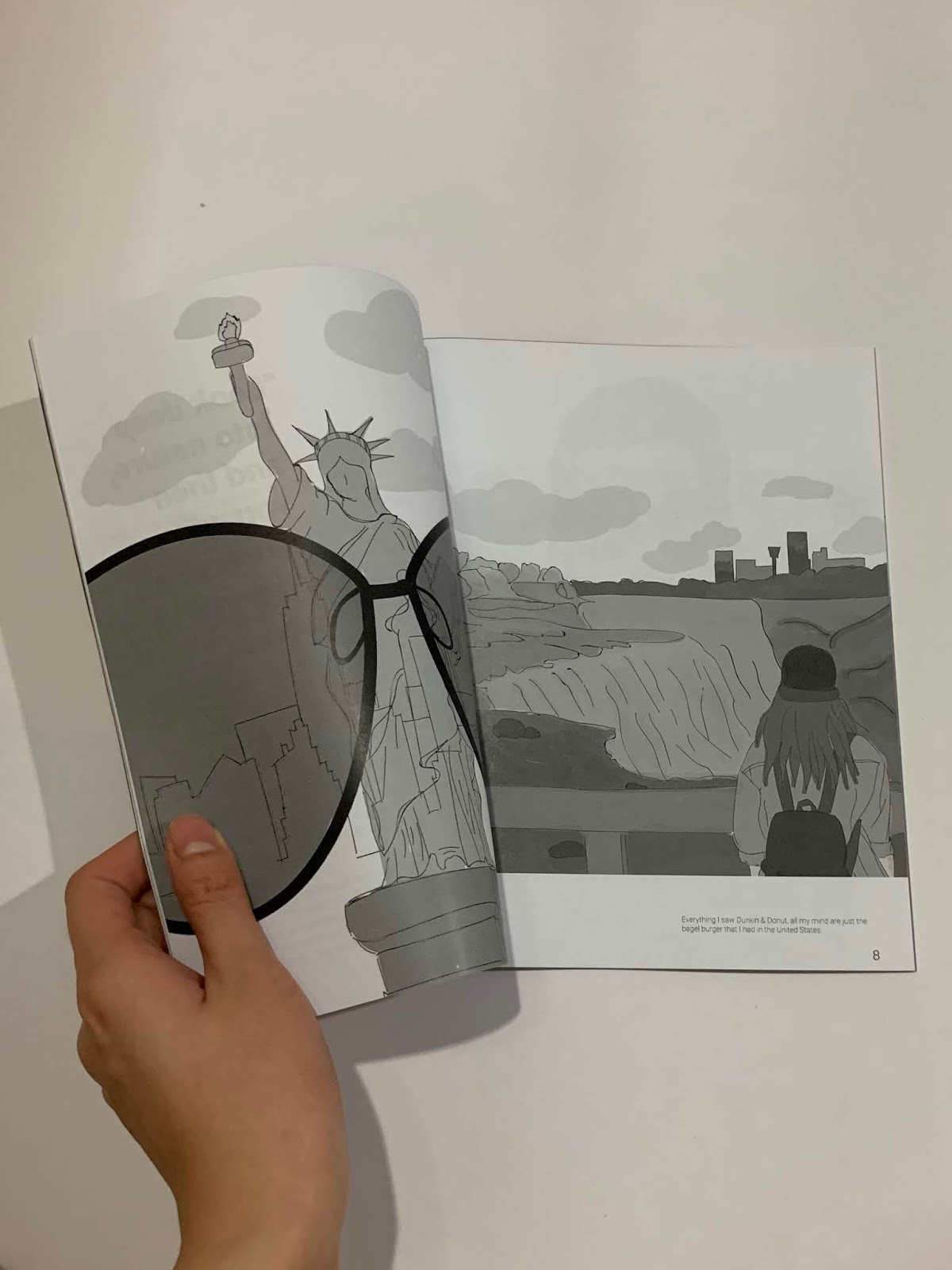
Figure 5.0: PDF of Thumbnail


Figure 1.0: Layout References

Figure 2.0 Process of create different grid

Figure 2.1: Process of choosing typefaces

Figure 3.0: First Attempt of the book layout

Figure 3.1: Second Attempt of the book layout

Figure 3.2: Second Attempt of the book layout

Figure 3.3: Third Attempt of the book layout

Figure 3.4: Third Attempt of the book layout

Figure 3.5: Third Attempt of the book layout
After few changes, I finally came out with my final attempt for my book layout

Figure 4.0: Page 1

Figure 4.1: Page 2-3

Figure 4.2: Page 4-5

Figure 4.3: Page 6-7

Figure 4.4: Page 8-9

Figure 4.5: Page 10-11

Figure 4.5: Page 10-11

Figure 4.6: Page 12-13

Figure 4.7: Page 14-15

Figure 4.8: Page 16-17

Figure 4.9: Page 18-19

Figure 4.10: Page 20-21

Figure 4.11: Page 22-23

Figure 4.12: Page 24-25

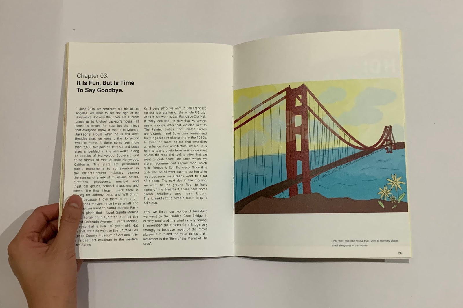
Figure 4.13: Page 26-27

Figure 4.14: Page 28-29

Figure 4.15: Page 28-29
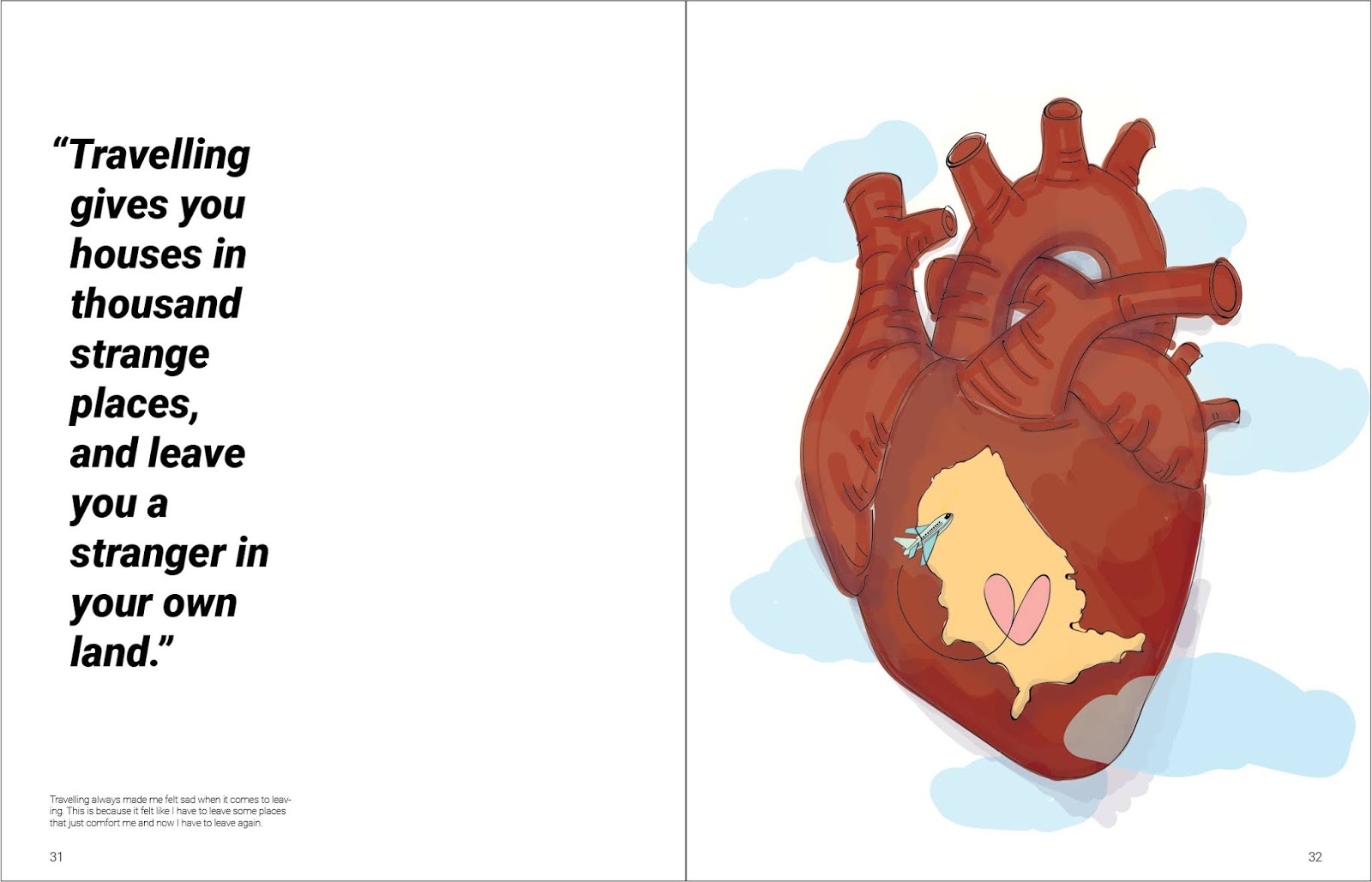
Figure 4.16: Page 30-31

Figure 4.17: Page 32-33

Figure 4.18: Page 30-31

Figure 4.19: Page 32-33
PDF of Thumbnail:
Here are the best 10 spreads of my final book:
Best 10 Spreads
Spread 1
Spread 2
Spread 3
Spread 4
Spread 5

Spread 6
Spread 7
Spread 8
Spread 9
Spread 10
After that, I also work on my book cover.

Figure 5.0: First attempt of book cover

Figure 5.1: Second attempt of book cover
Before we proceeding to the actual publication, we printed the black and white version with the actual size of our book.


FINAL OUTCOME:
Embedded PDF:
Printed Book:


FEEDBACK
Week 06
(01/10/2019)
For my specific feedback, Mr Vinod gave some comment about my book layout such as the references that i look for are for photo and my visuals are mostly illustration. Besides that, I have to change the typefaces to only one type family. Not only that, he also said that the space of my body text have to change.
Week 07
(08/10/2019)
For my specific feedback, Mr Vinod gave some comments about my layout which he think the photo should go wider and some of my pages should have double spread. Not only that, Mr Vinod said that I should adjust the ragging for the pull quote and I should change the titlle into a light Roborto. After i should Mr Vinod my second attempt, he said that everything is okay now and the layout of the book more solid and he asked me to think about the next steps which is the colour.
Week 08
(15/10/2019)
For my specific feedback, Mr Vinod gave me some suggestion for my book layout which he think iI should decrease the font size for the page number. Besides that, Mr Vinod told me that my line spacing for the subtext should be same as my body text. Not only that, Mr Vinod also gave some commented about my book cover which he think i should handwritten the book title with the plane window that i have for my book cover to make it more get into the cover.

FURTHER READING
Week 07
(08/10/2019)
An A-Z of Type Designers by Neil Macmillan

Chapter : Drawing letters and Type - Initial stages in designing type
In this book, the author talks about the difficulties faced when designing a new type, especially in the current digital age where type designer needs to be aware of software requirements and constrained to fit the outlines imposed by the computer. However, even with the benefits and burdens a computer carries, the basic roots of type design have not changed. Often, a type aims to be legible and stylish and it needs to function well in its intended context and to offer some degree of interest to the eye.
Idea is one of the most difficult aspects of designing type is the idea. The author tells that by noting down thoughts, make quick drawings, identifying reference material intended to study in his sketchbook, his design has a chance to develop freely without the constraints of the computer. "As my initial ideas become more focused, questions arise : the size of the character set, how many weights and widths (light to heavy, condensed to wide) the type family will have; wether the italic will be cursive or sloped. And if the font has serifs, what style could there be? At the same time I begin to sketch several key characters, taking tentative looks at character and font proportion and structure: the x-height in relation to the character width and stroke weight; the arch of the 'n' and how it joins the stem; the descender depth and ascender height to cap height and x-height. Most of the personality of a type can be found in its lower-case, and I tend to start here, possibly with 'a, e, f, g, n'. The sketchbook is a perfect place to throw ideas down. I use a pen and treat each mark I have as a permanent visual record in the type's development." he said.


Comments
Post a Comment